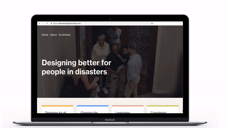
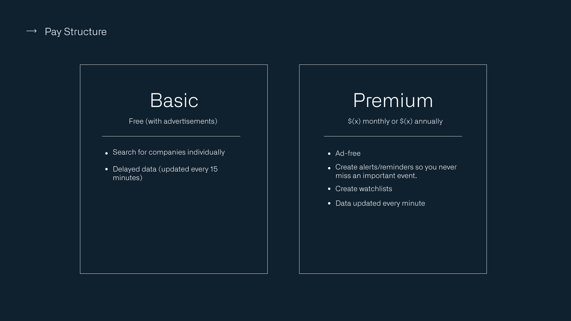
Disaster Design Principles
disasterdesignprinciples.com is a
library that provides guidance and resources for designing in the context of disasters.
The principles are exemplified and research-backed and act as a starting point or as a user-centered checklist for teams working on their own people facing systems.This library is currently online and accessible to any team working on the topic.
Designers:
Brittany Williams, Amelia Koster, Catherine Legros
Role:
Visual design, UI Design
Problem
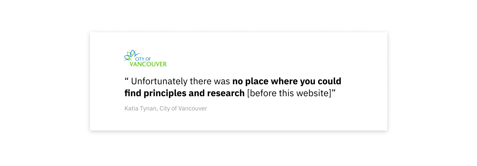
The research on people’s behaviours in disasters was scattered
and the best design practices were not shared efficiently to the municipalities and teams in charge. Disaster Design Principles is a central resource to solve this problem.
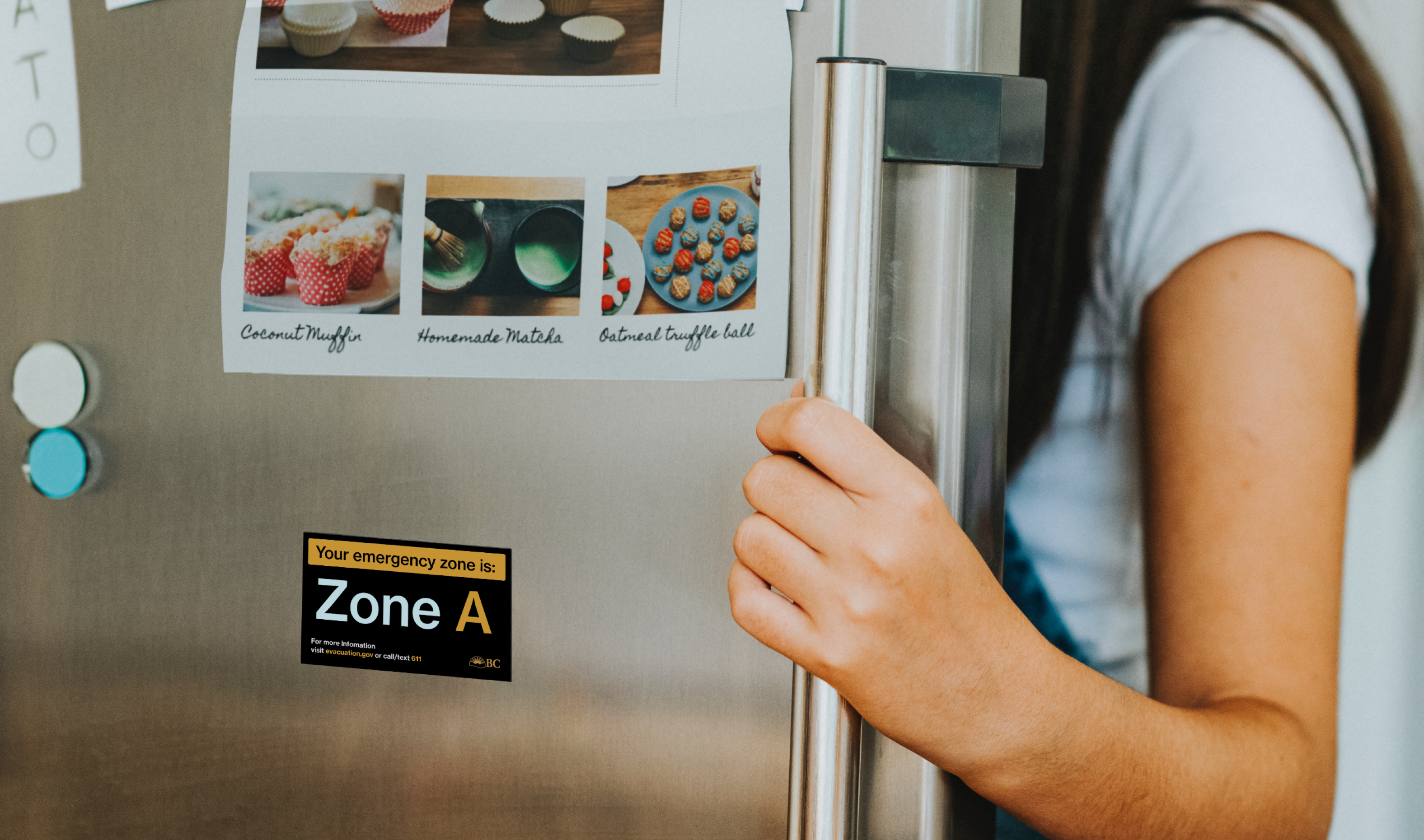
This need was highlighted when speaking to Katia Tynan at the City of Vancouver’s Resiliency Office. She shared several insights and common misconceptions with us. When we asked if there was a place where all that information was gathered, we found:
Impact
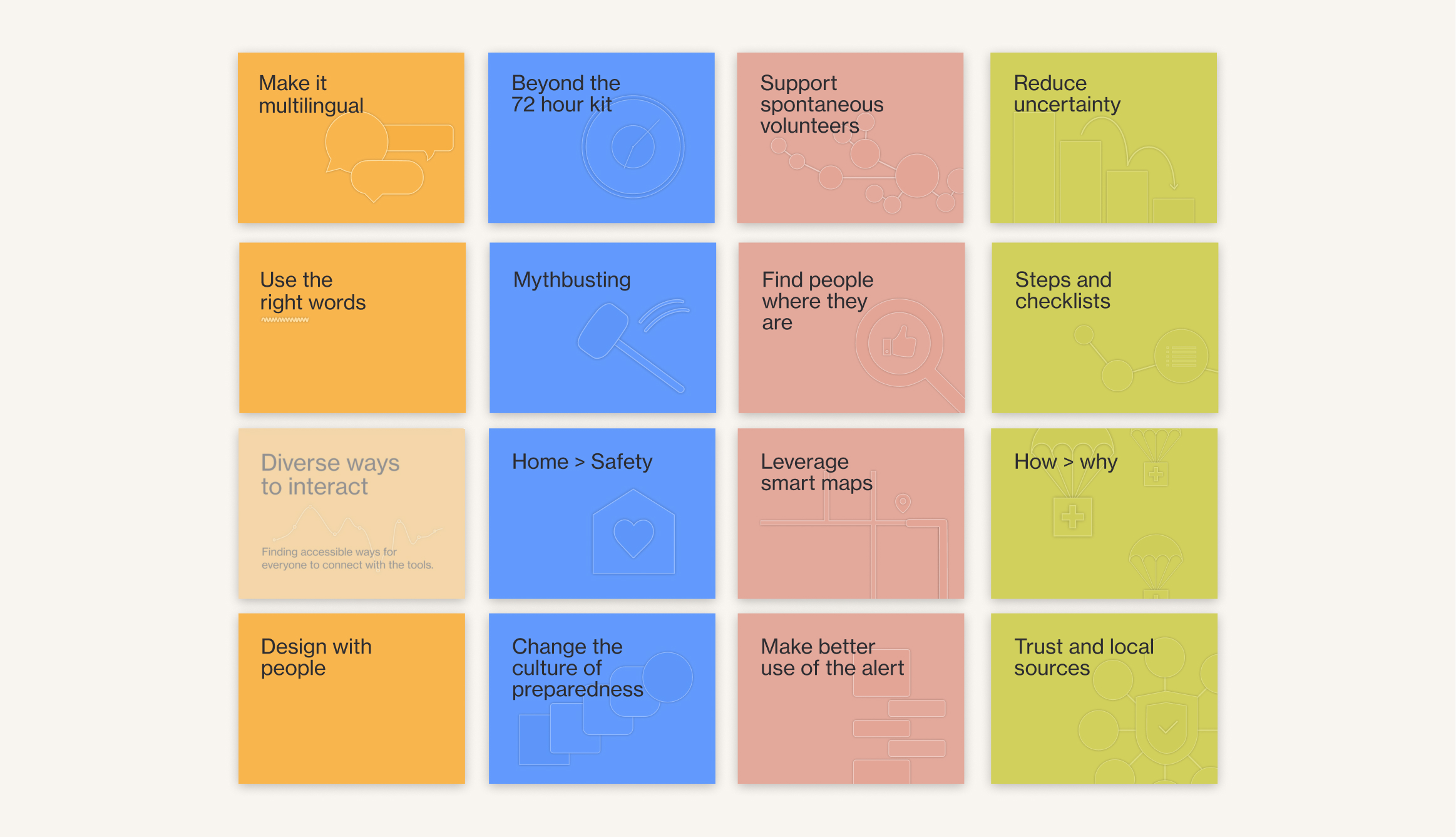
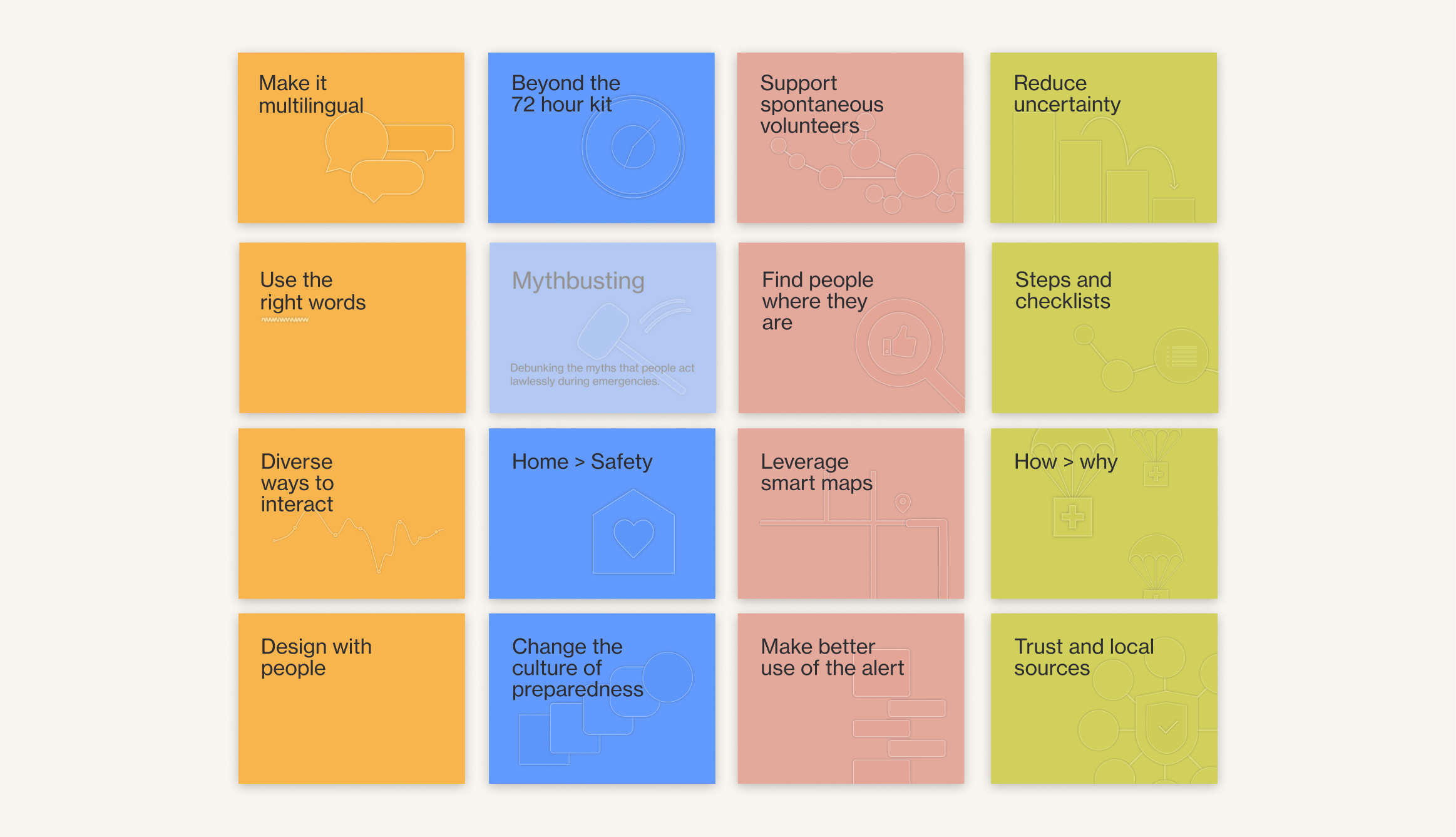
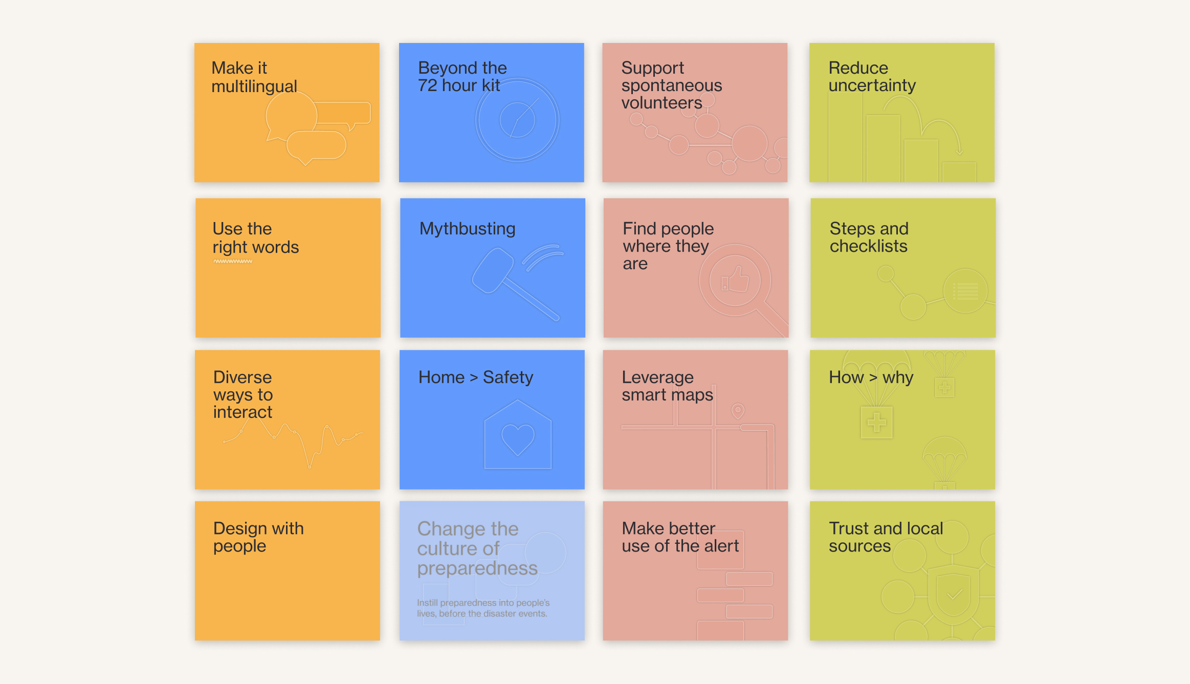
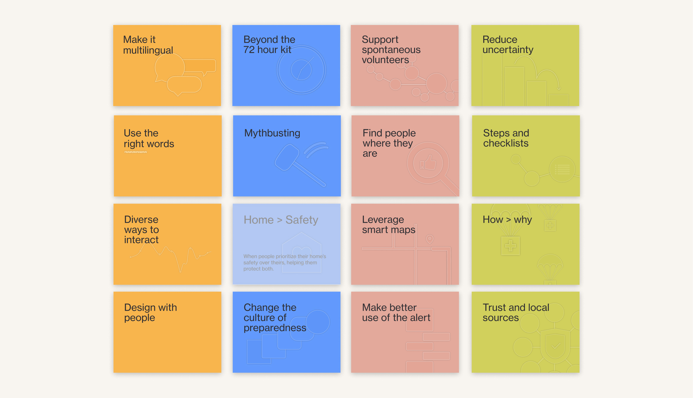
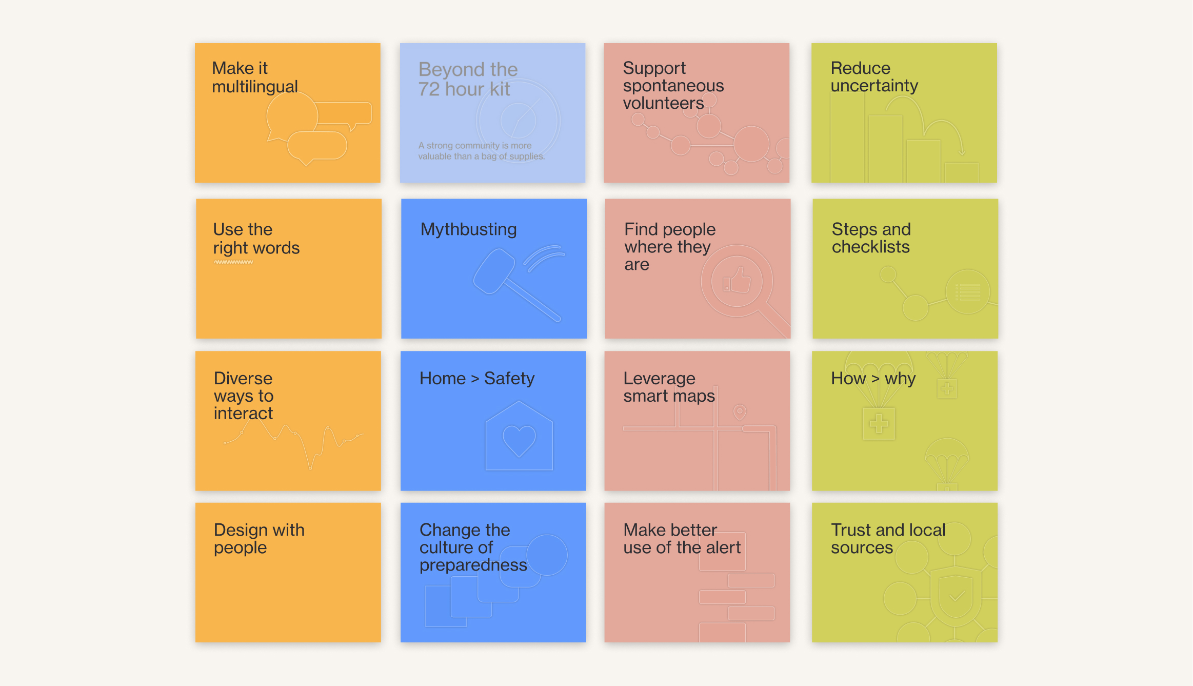
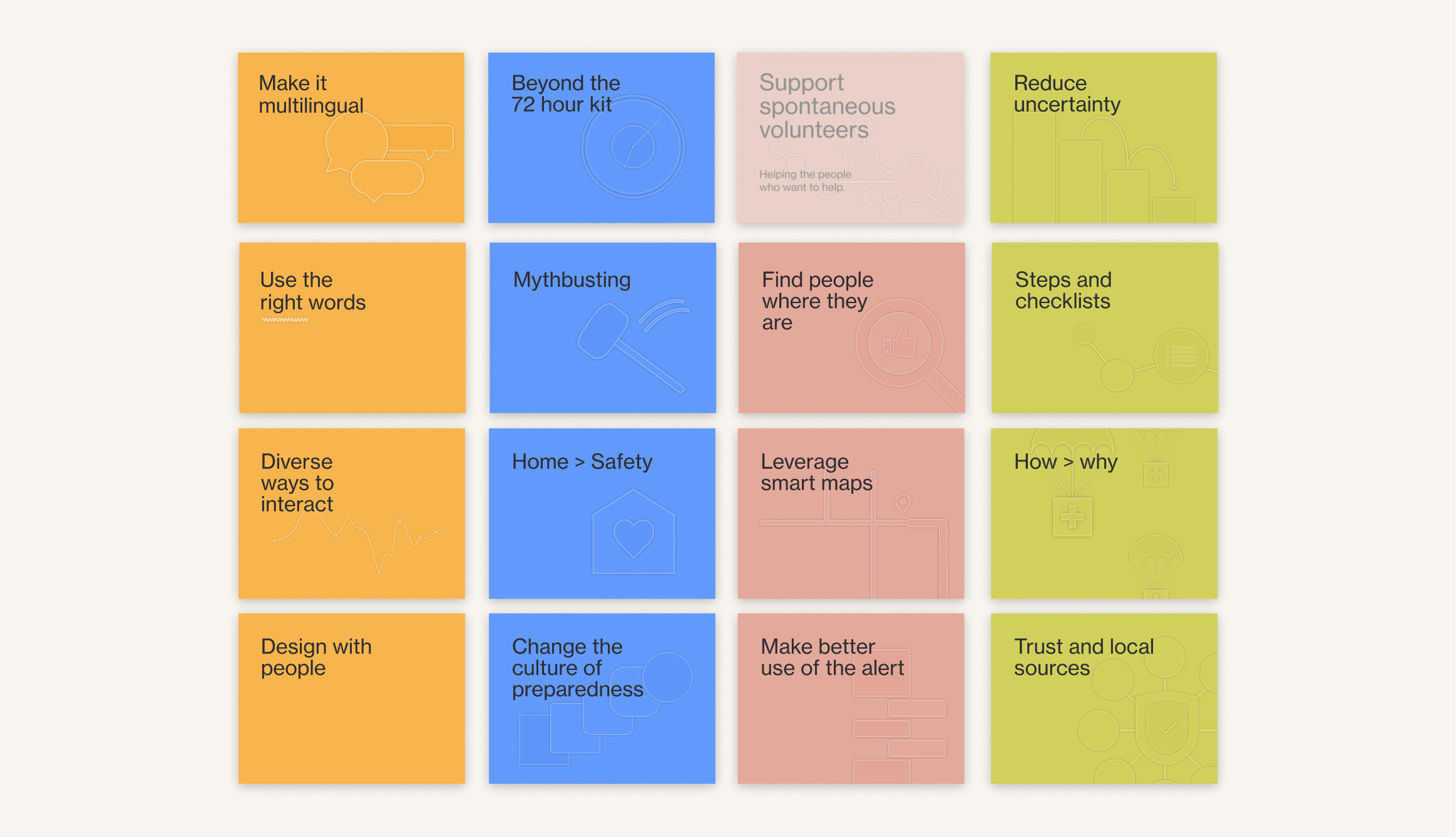
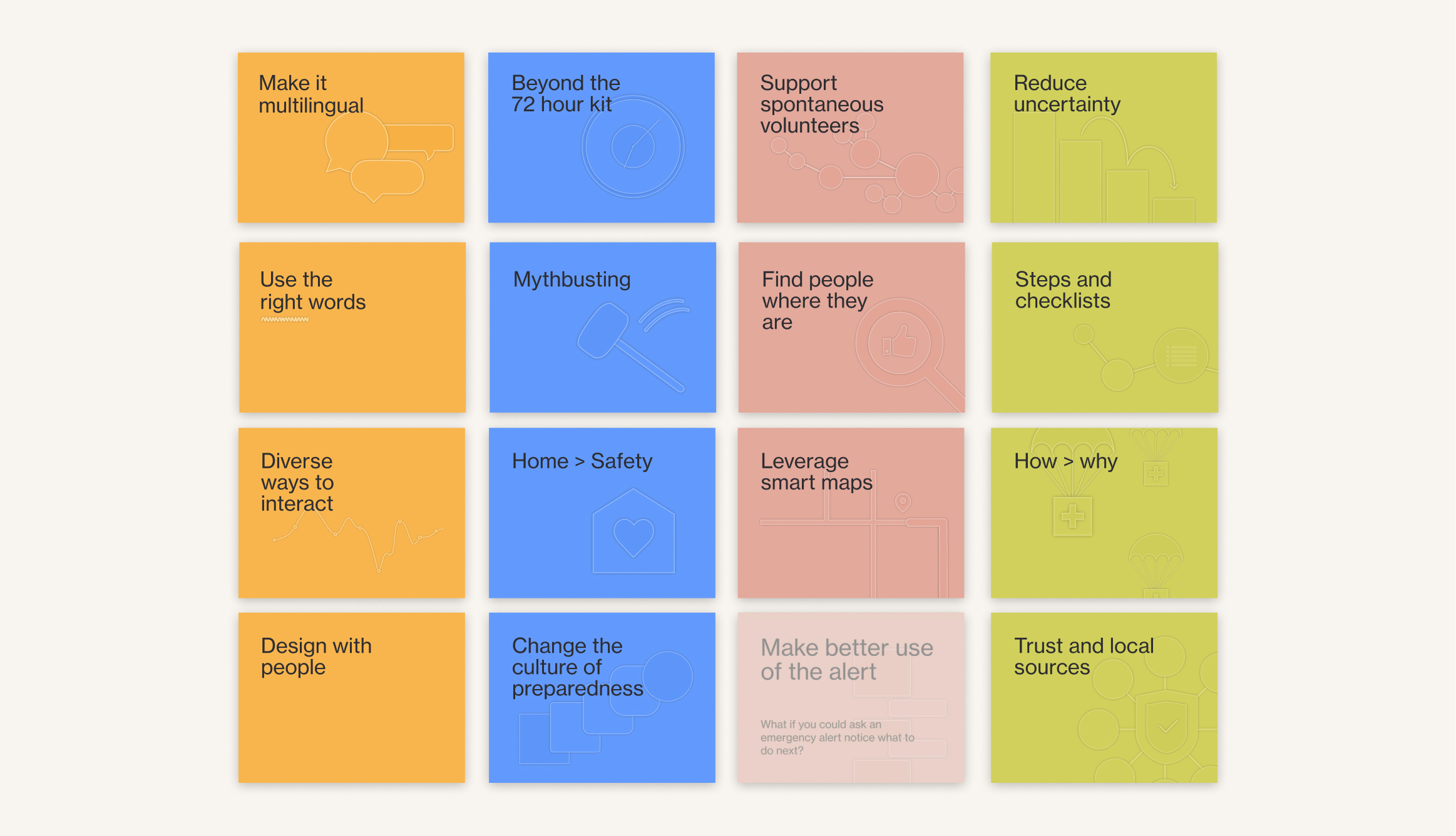
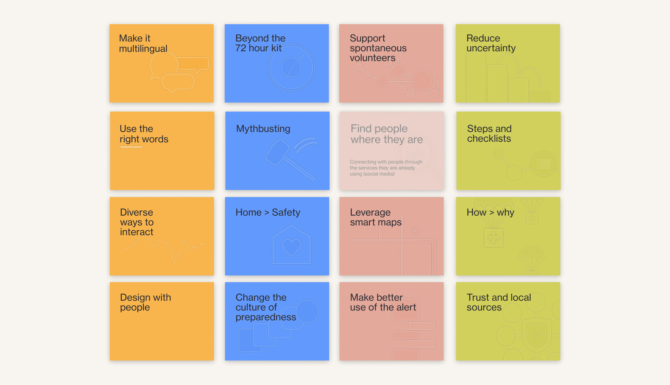
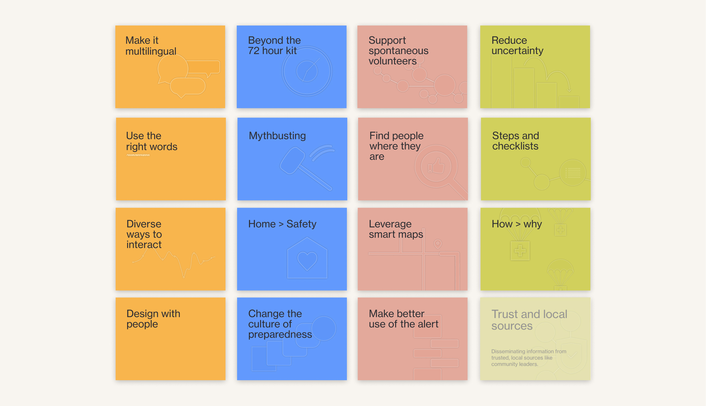
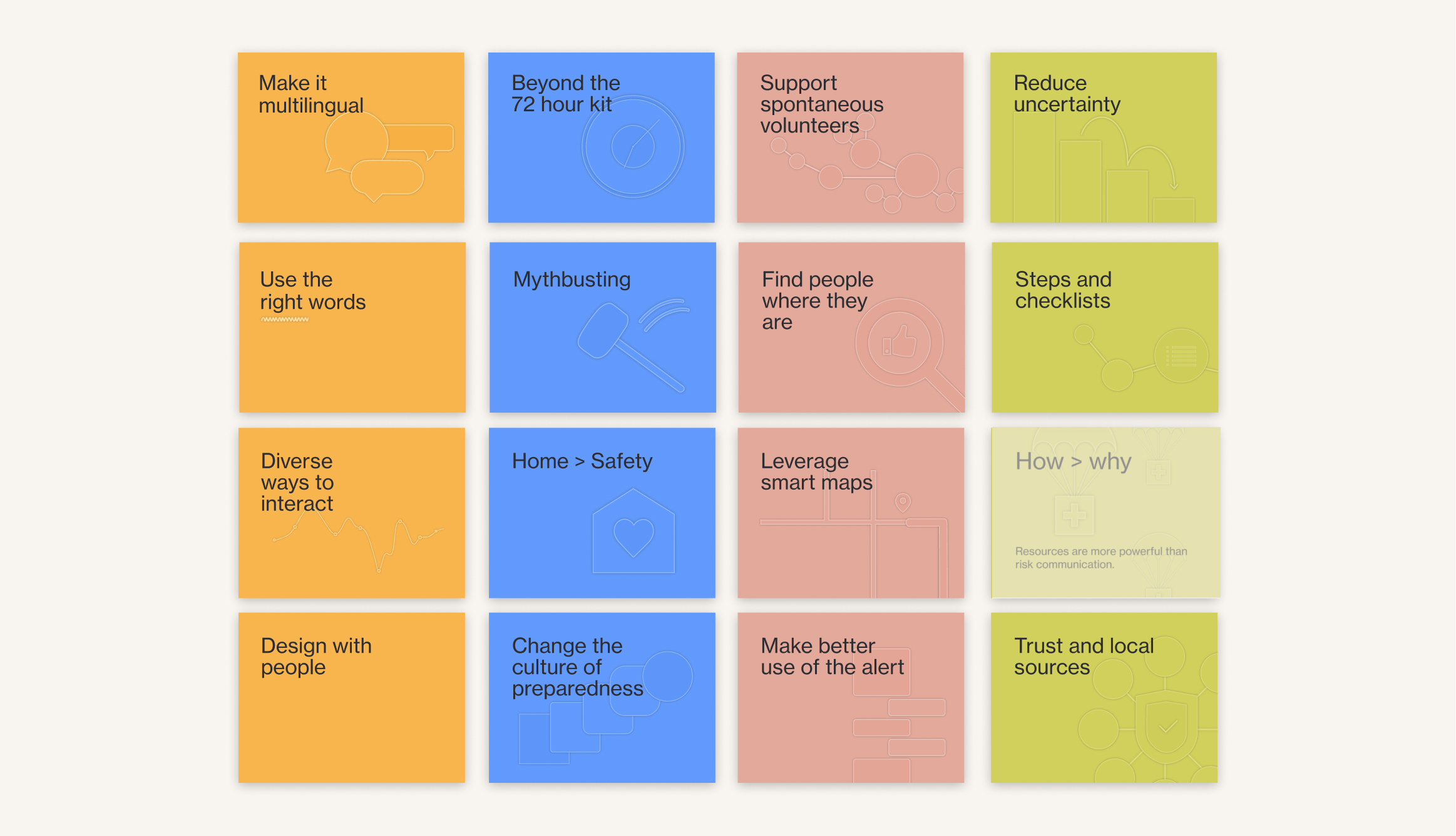
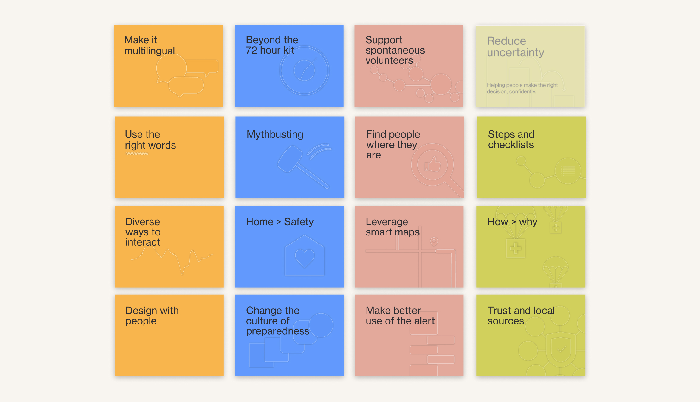
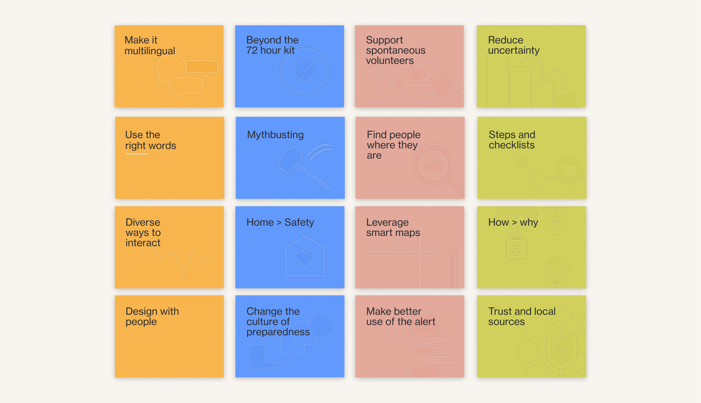
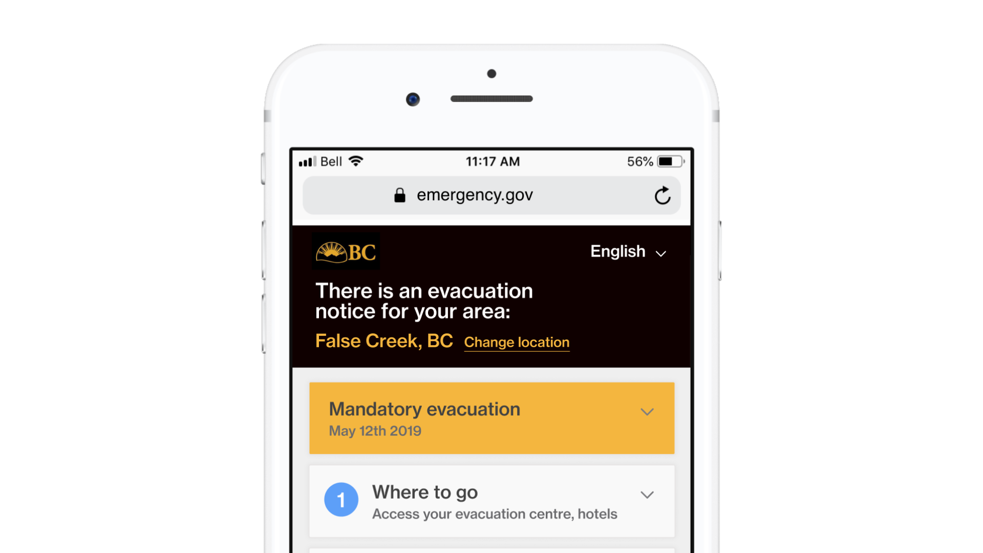
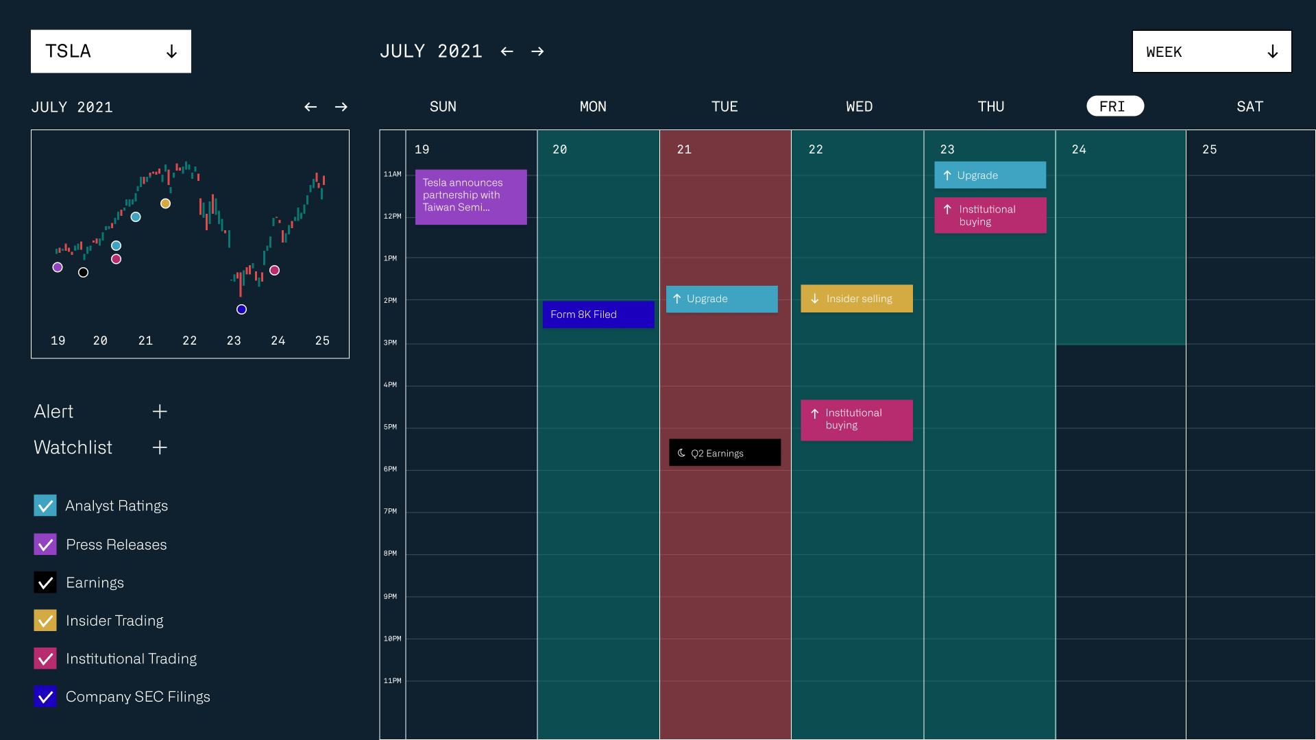
Homepage UI
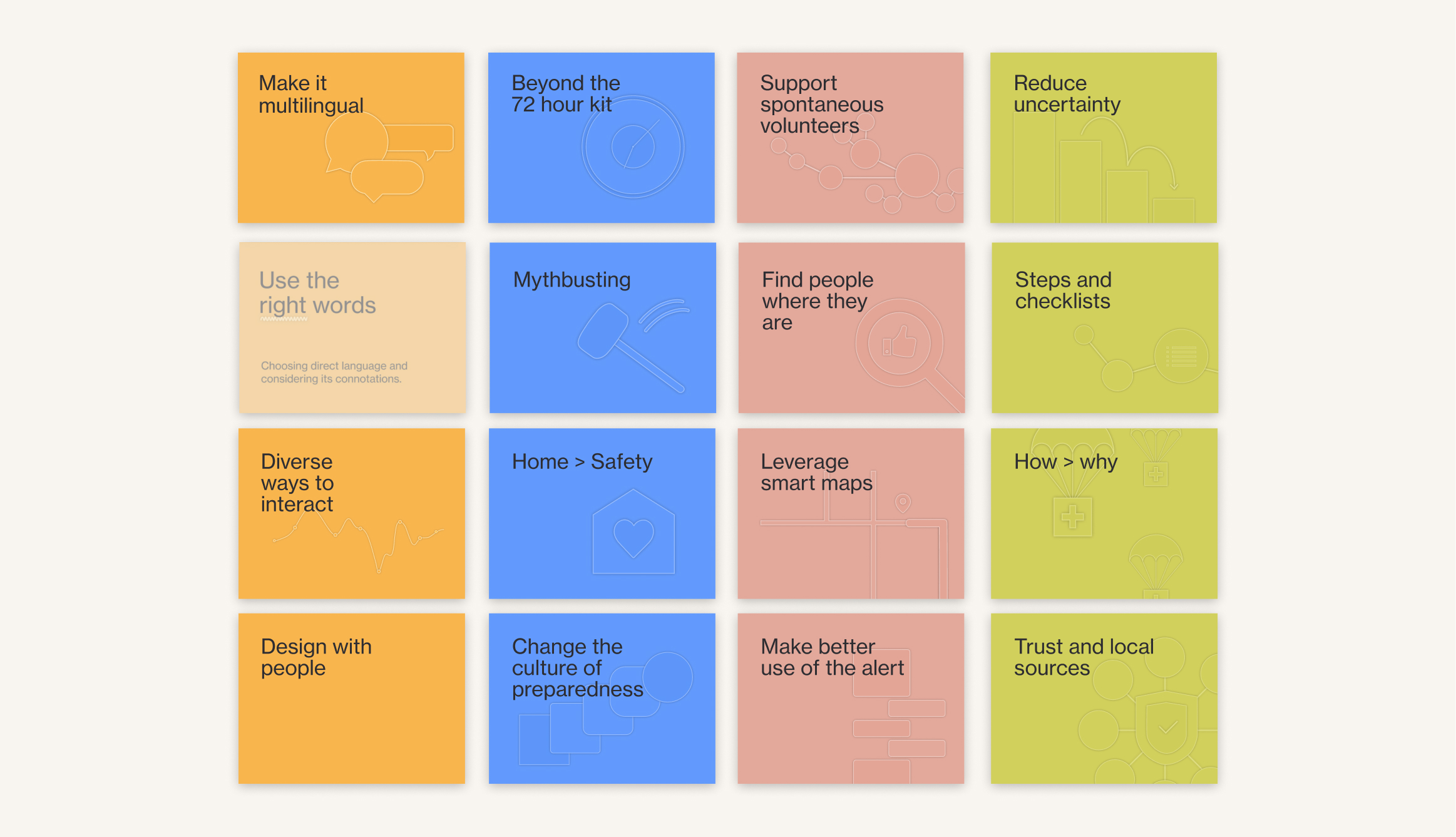
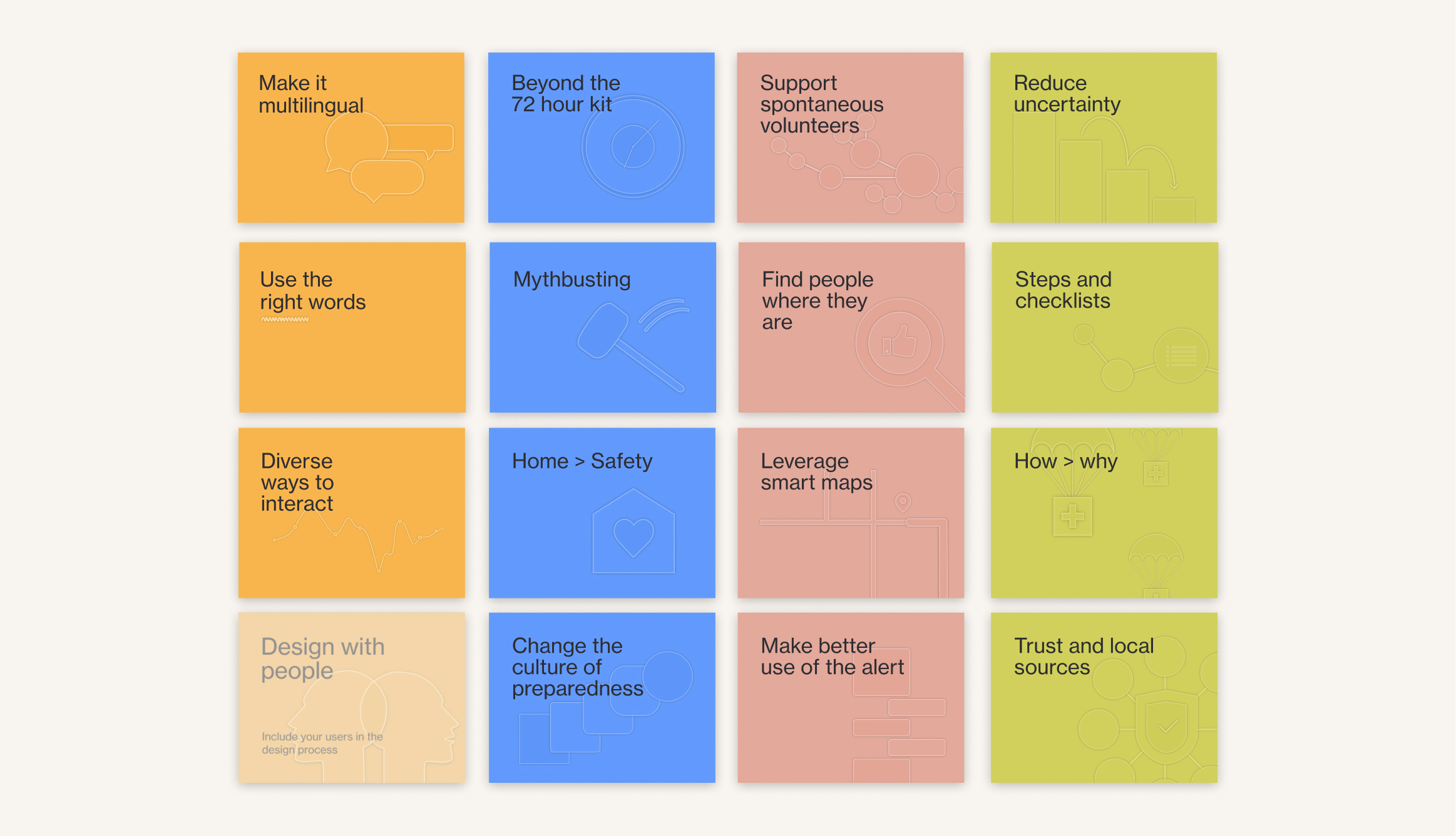
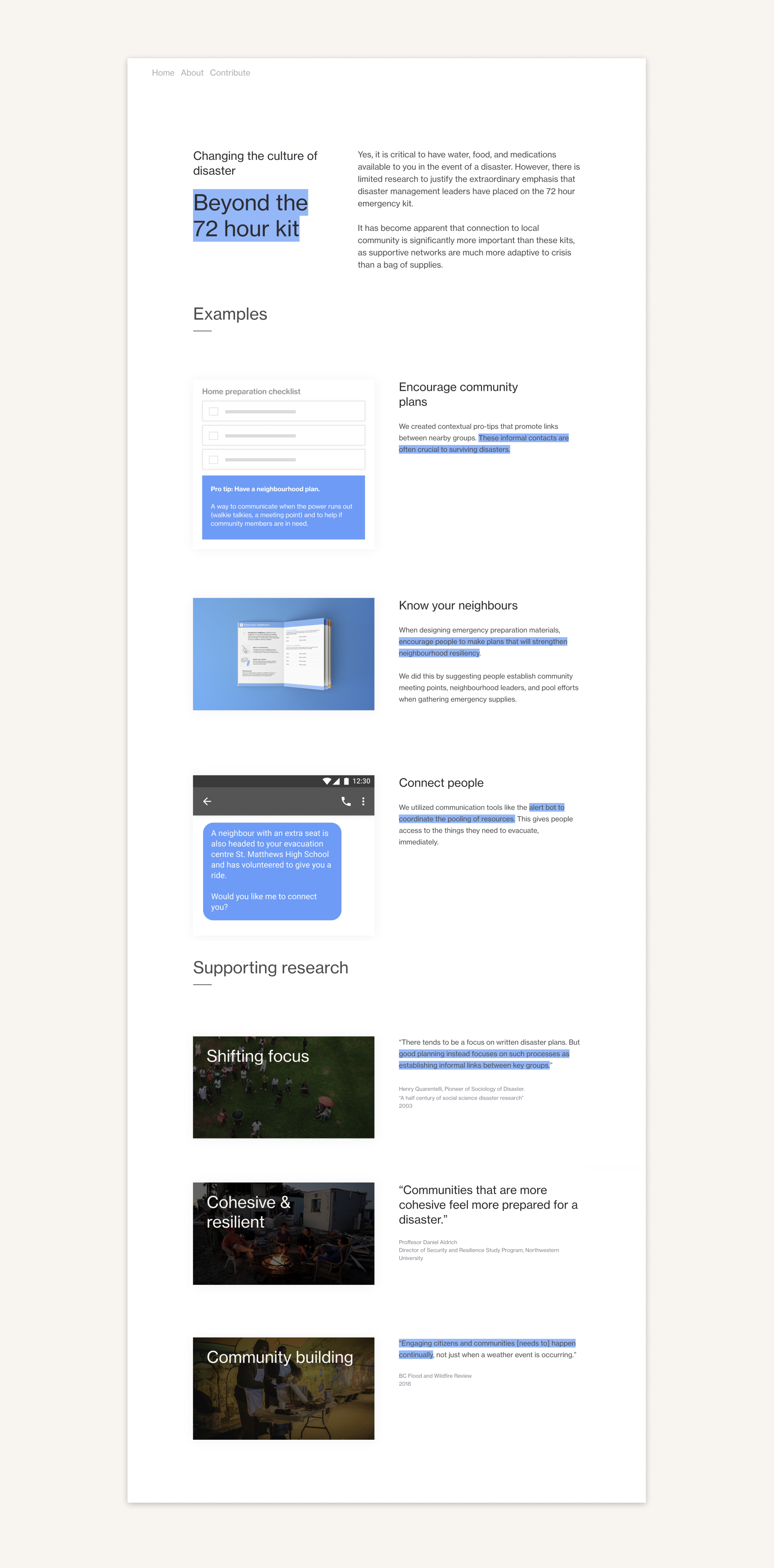
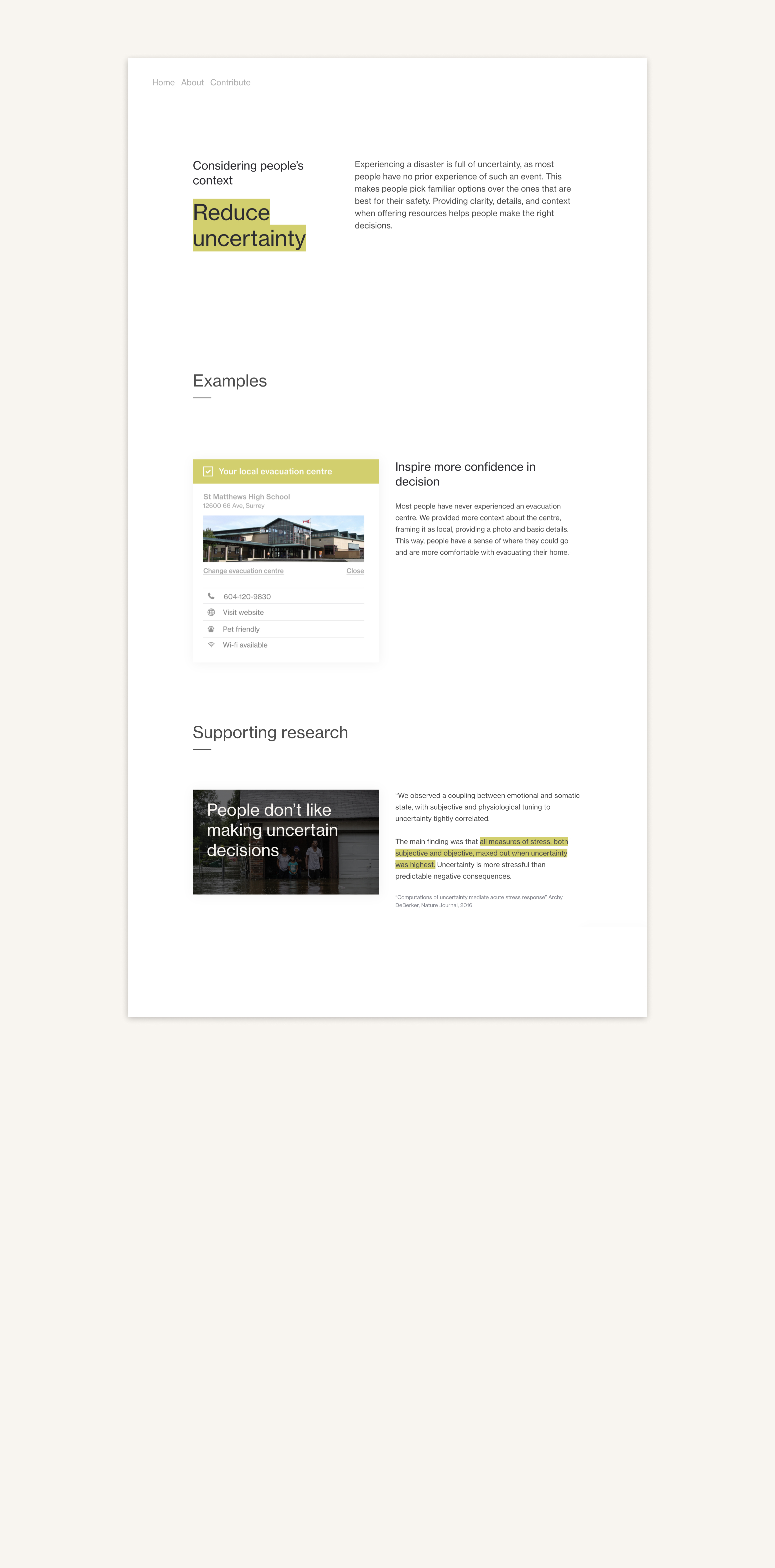
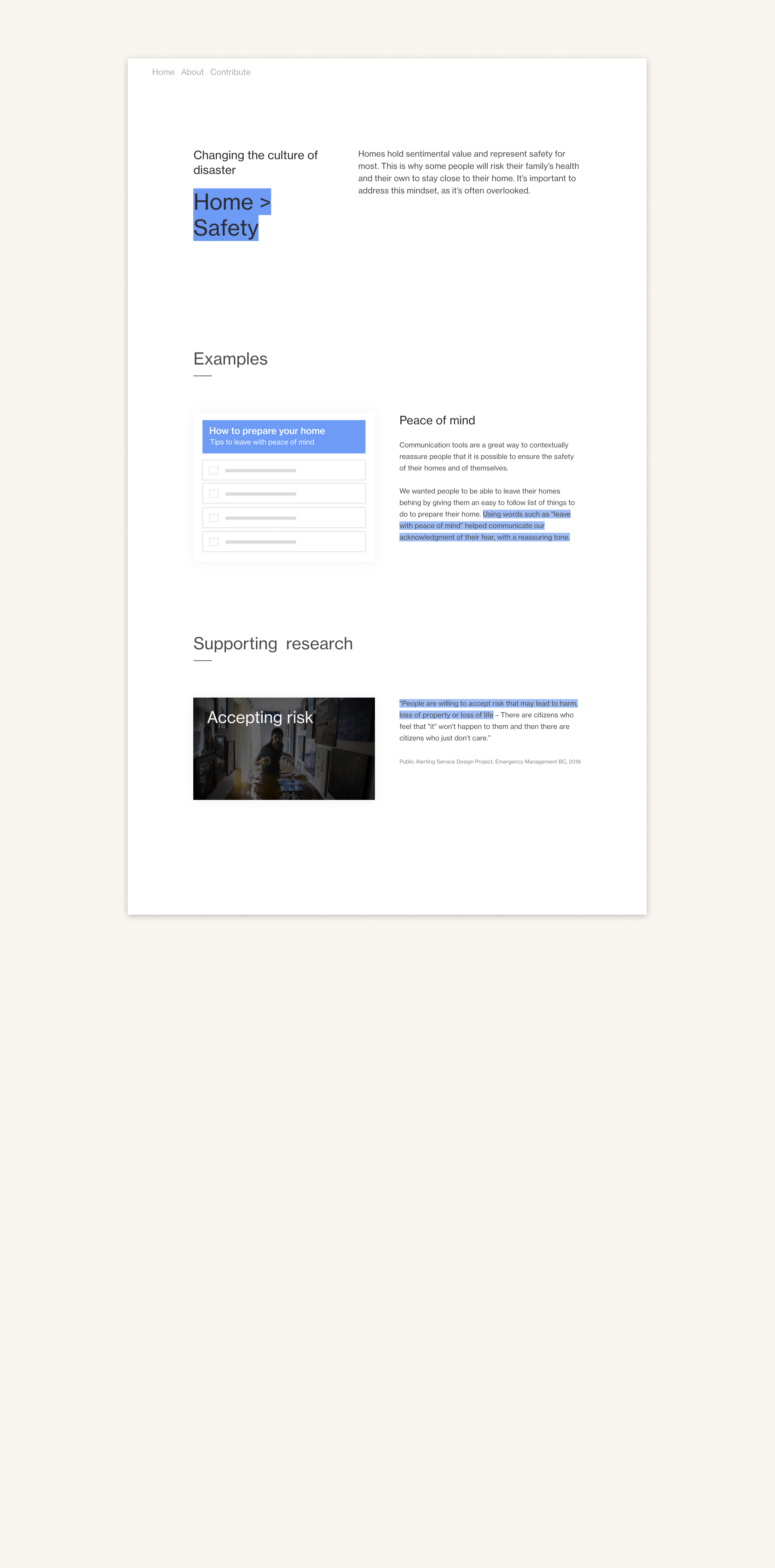
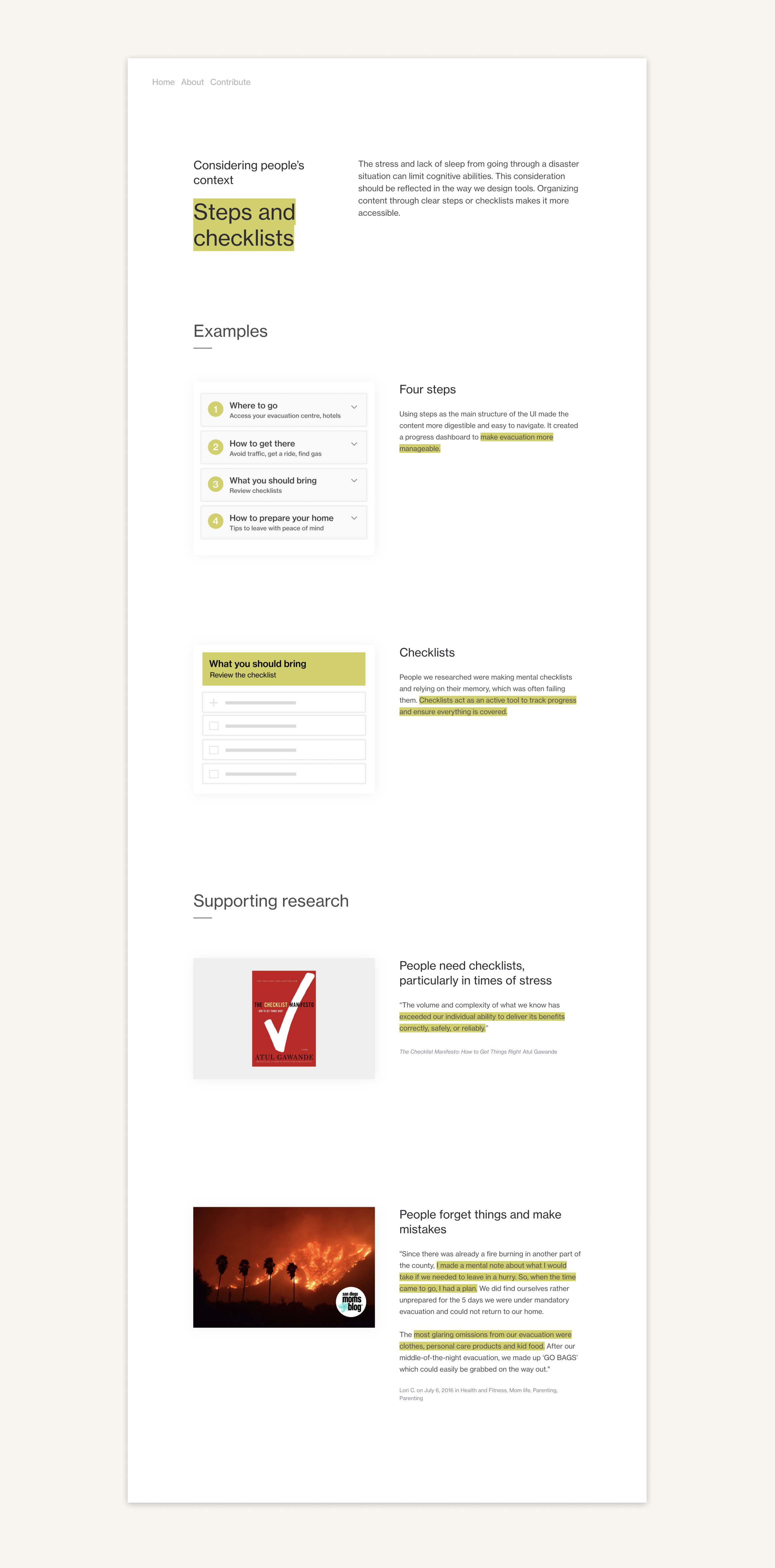
Our research insights are organized under four pillars on the homepage.
The 16 principles are
illustrated with an organized, graphic, visual design tone
to create a effective learning environment for those tasked with designing for disasters.


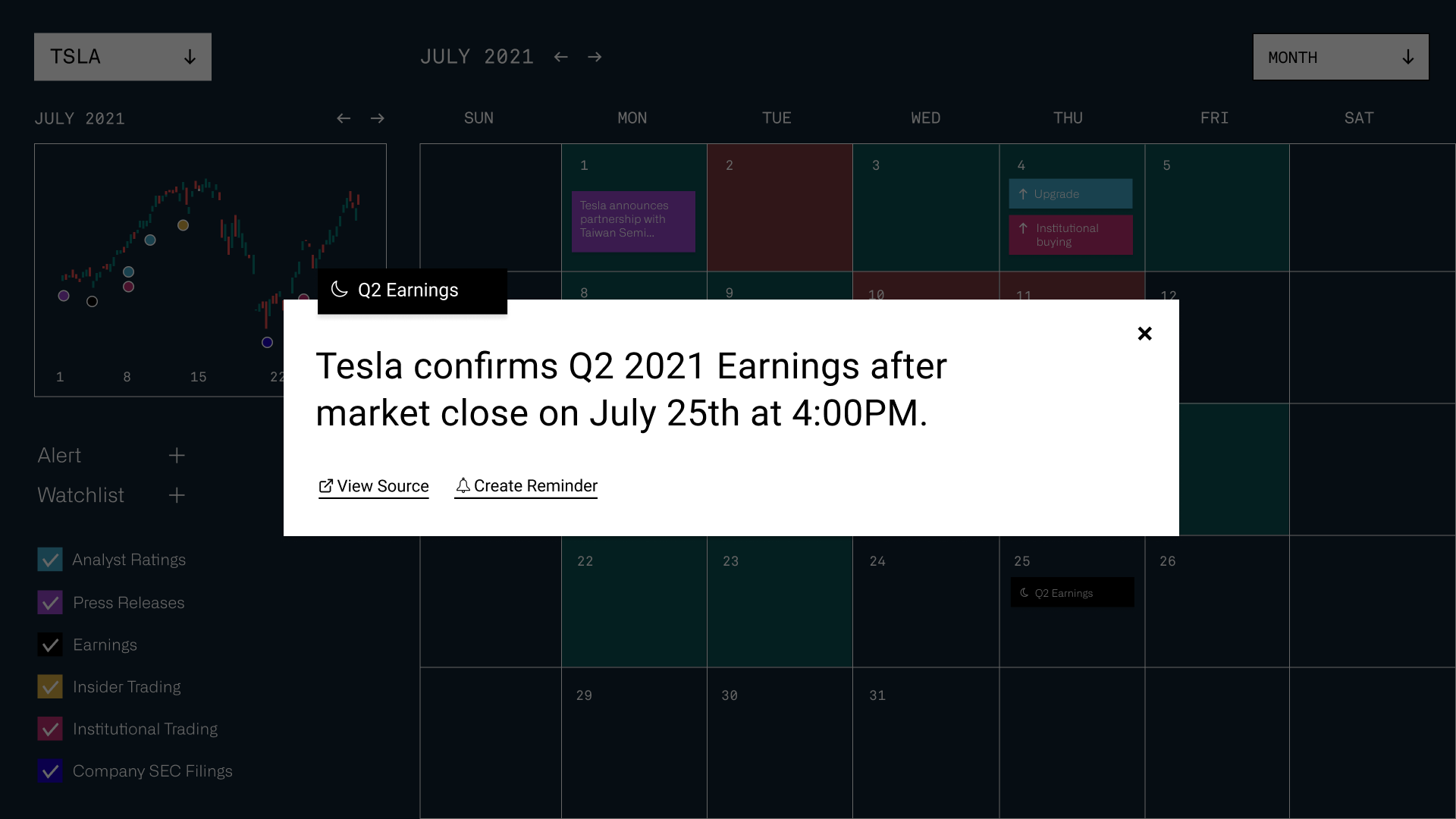
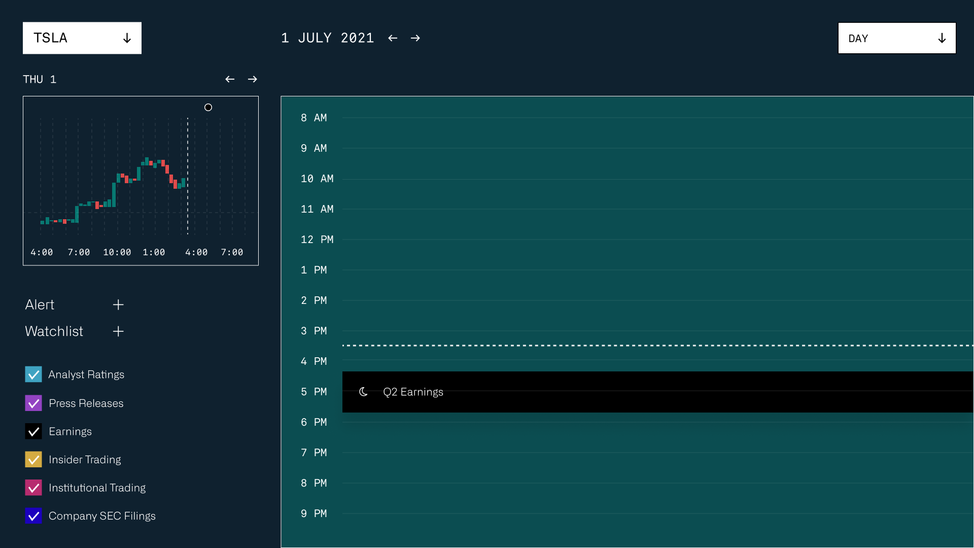
The Principle Pages
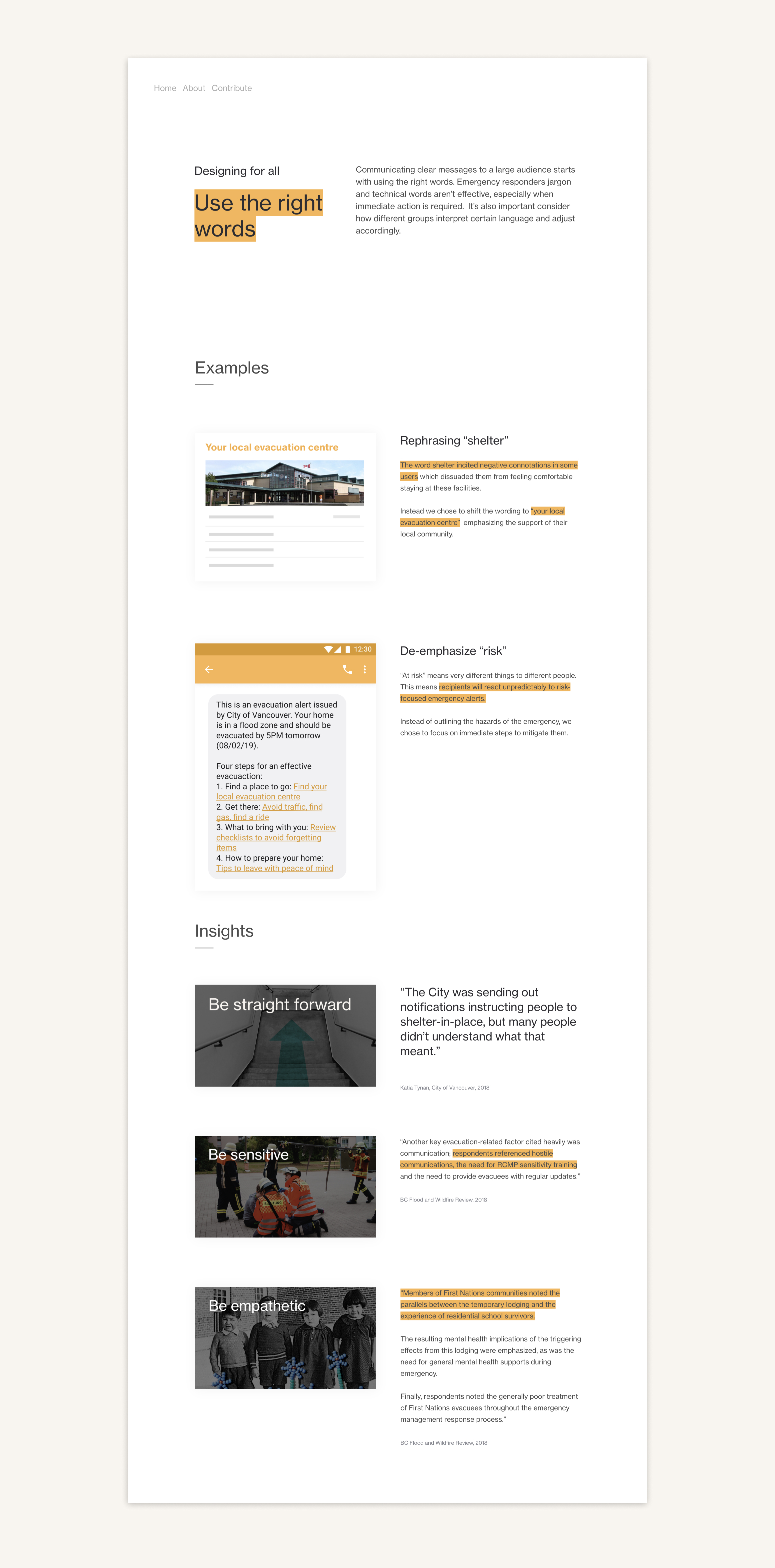
We included design examples supported by our research insights for each of the 16 principles.


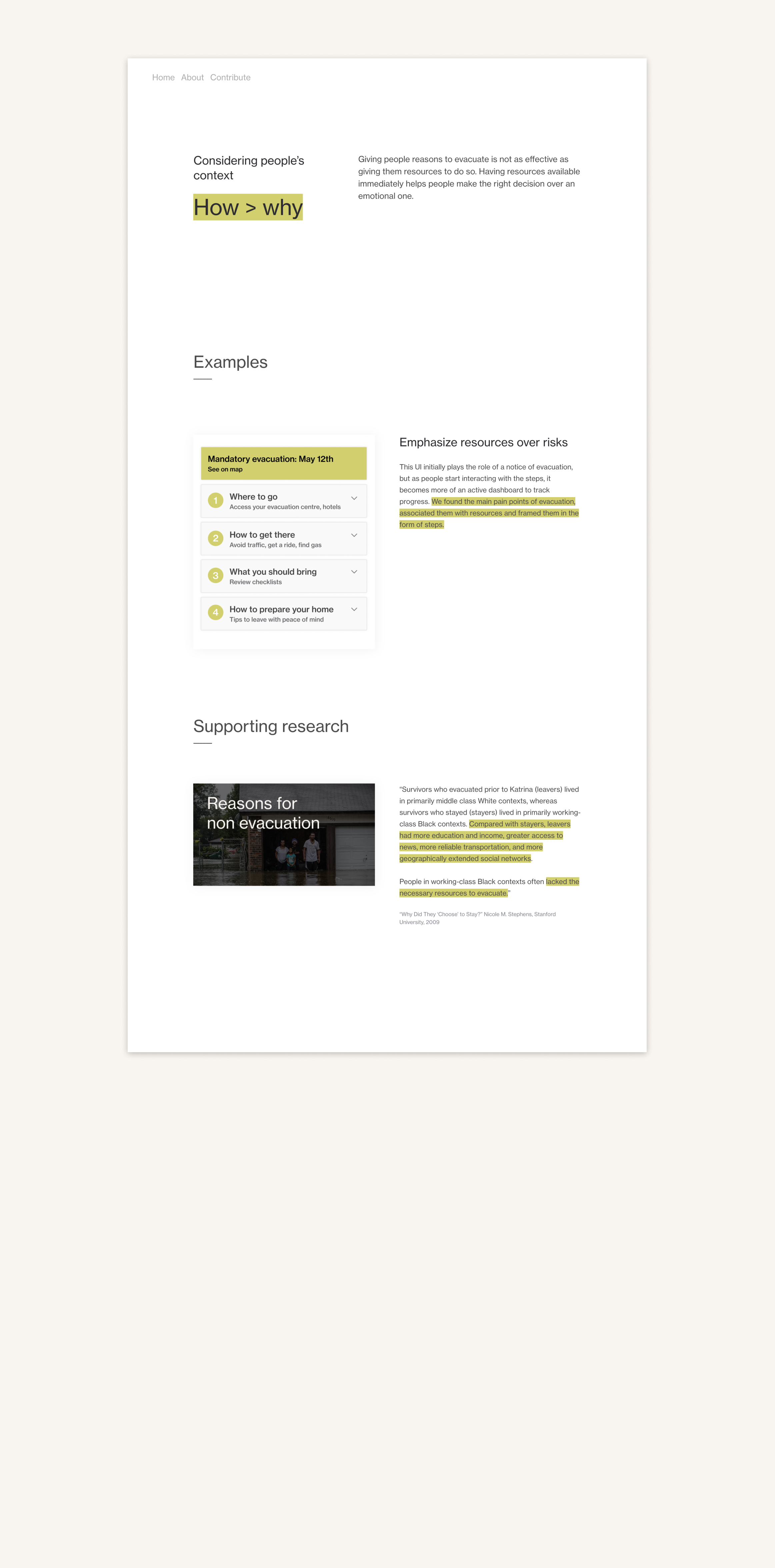
How did we get there?
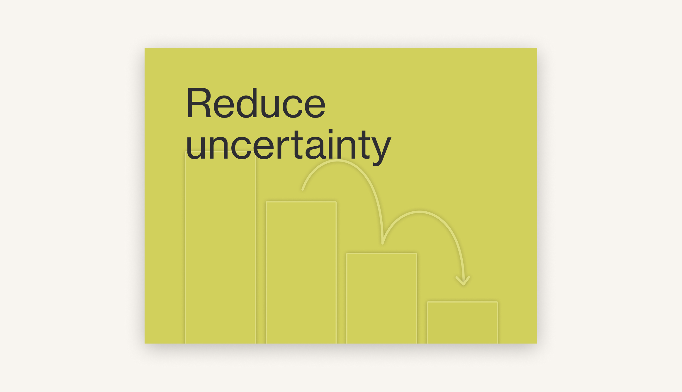
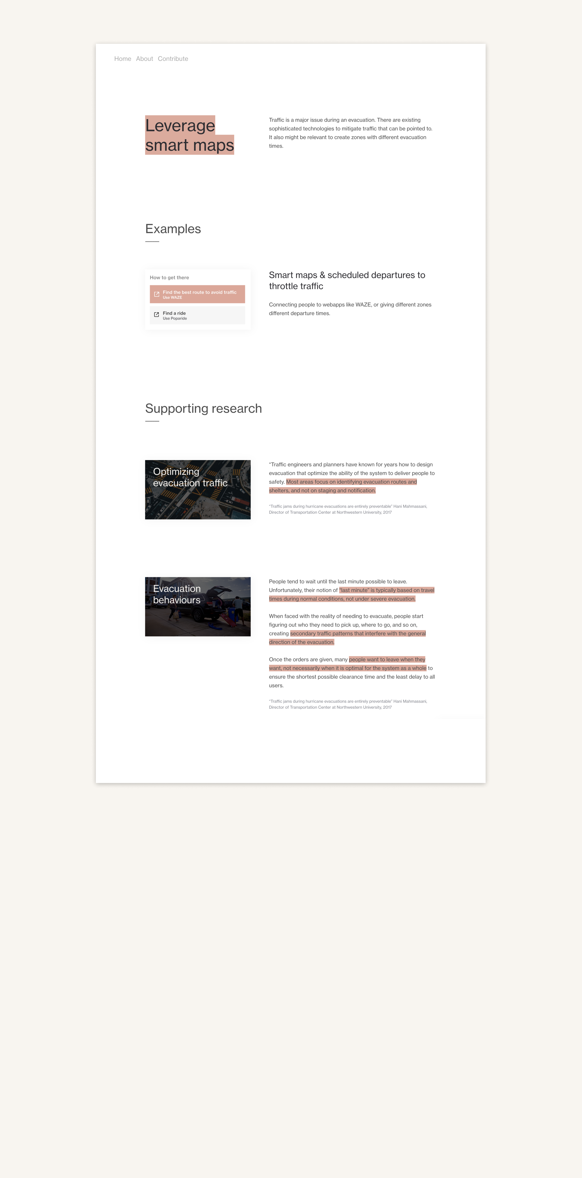
With the goal of improving people’s decision making during a disaster
we designed multiple touch points that would positively influence people’s behaviours.In particular, we focused on improving decision making around evacuation in situations where there is a window of time for evacuation (forest fires, floods).
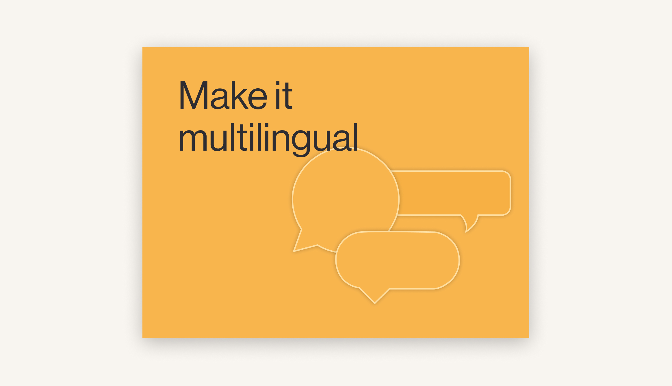
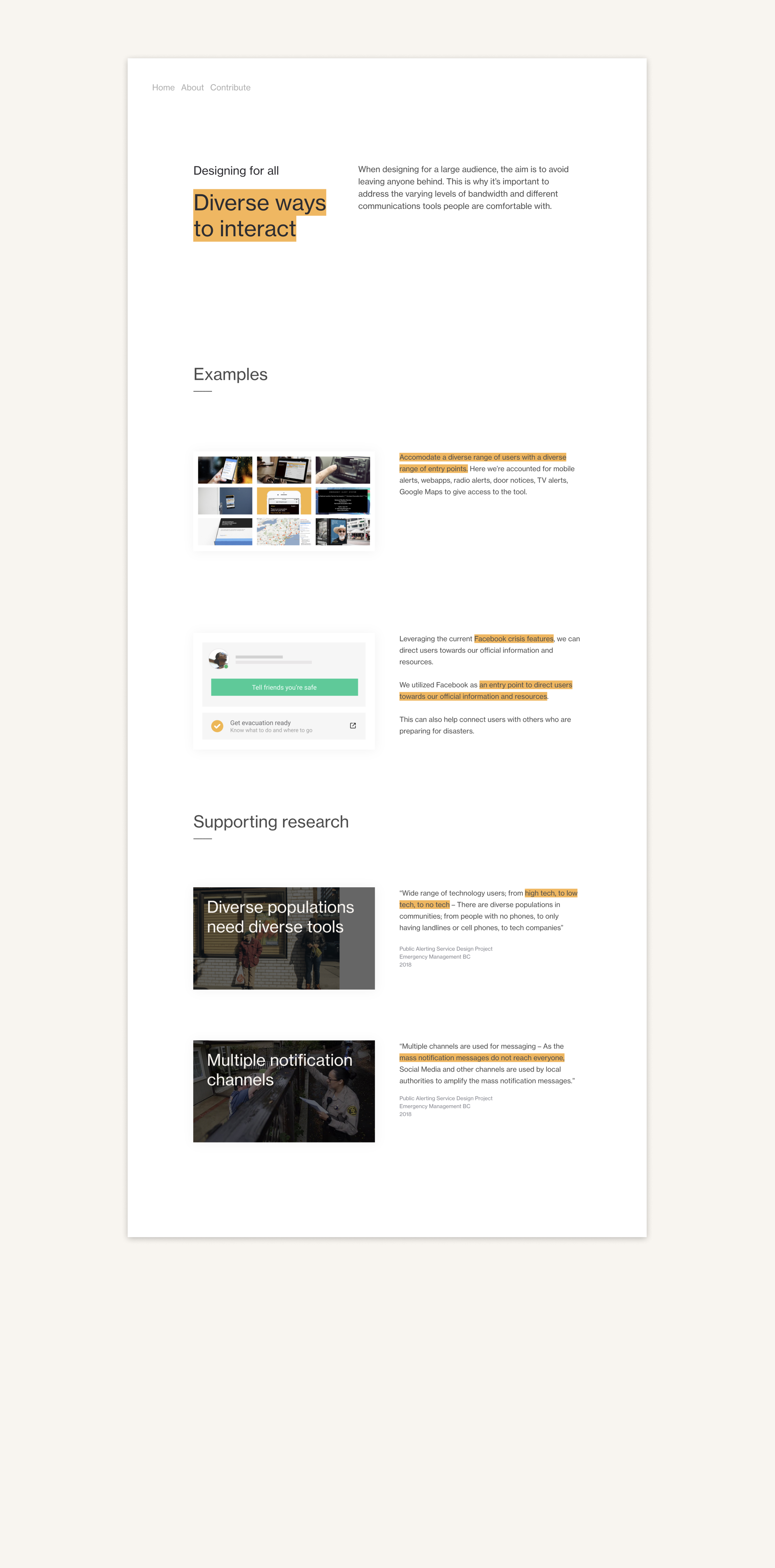
We researched and designed
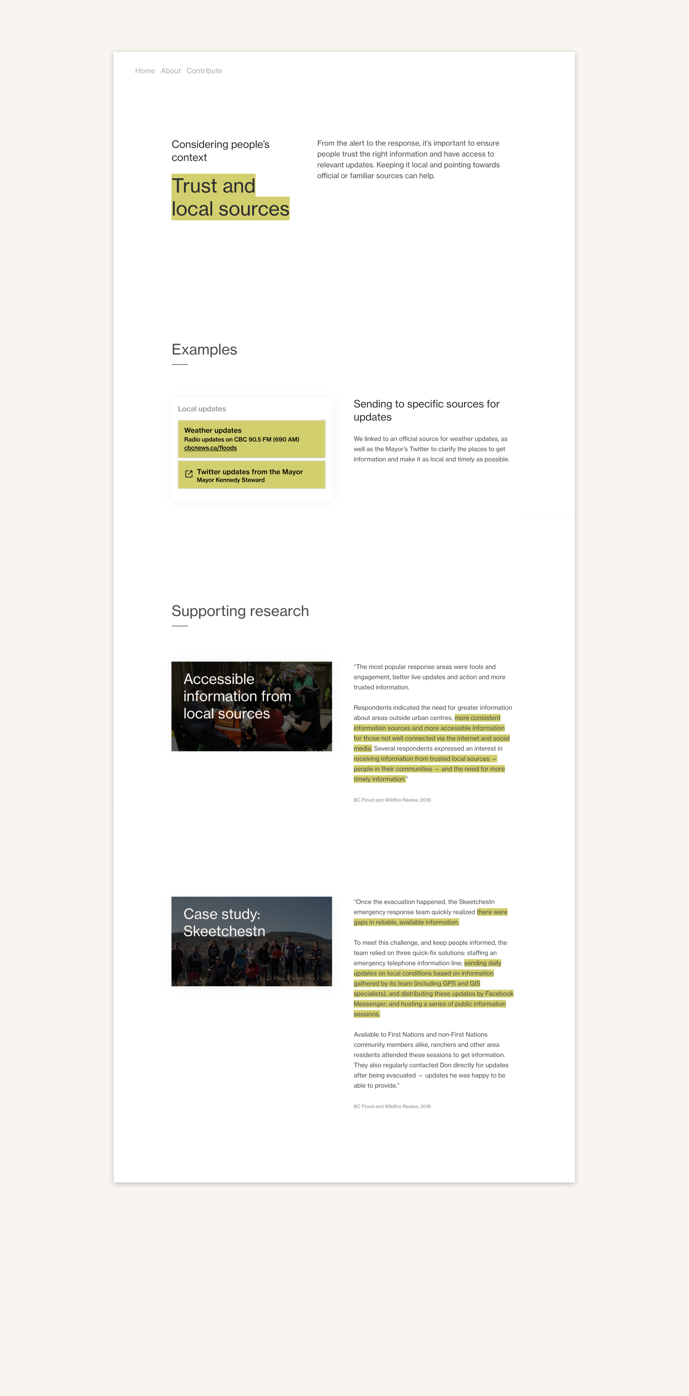
a tool that focused on offering contextual resources,
which would have severalentry points and touchpoints,
to make sure it reached the whole population.


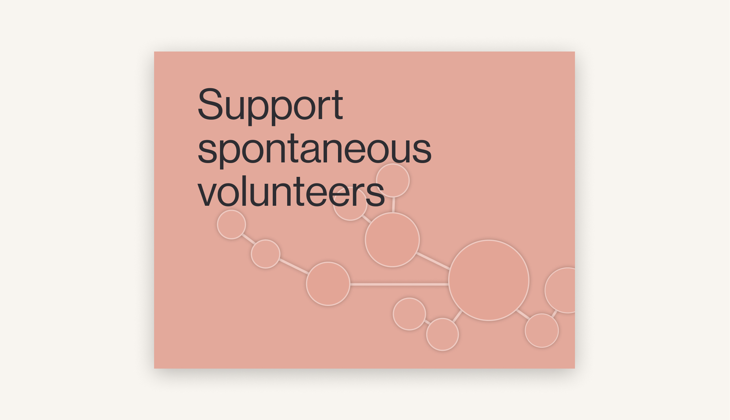
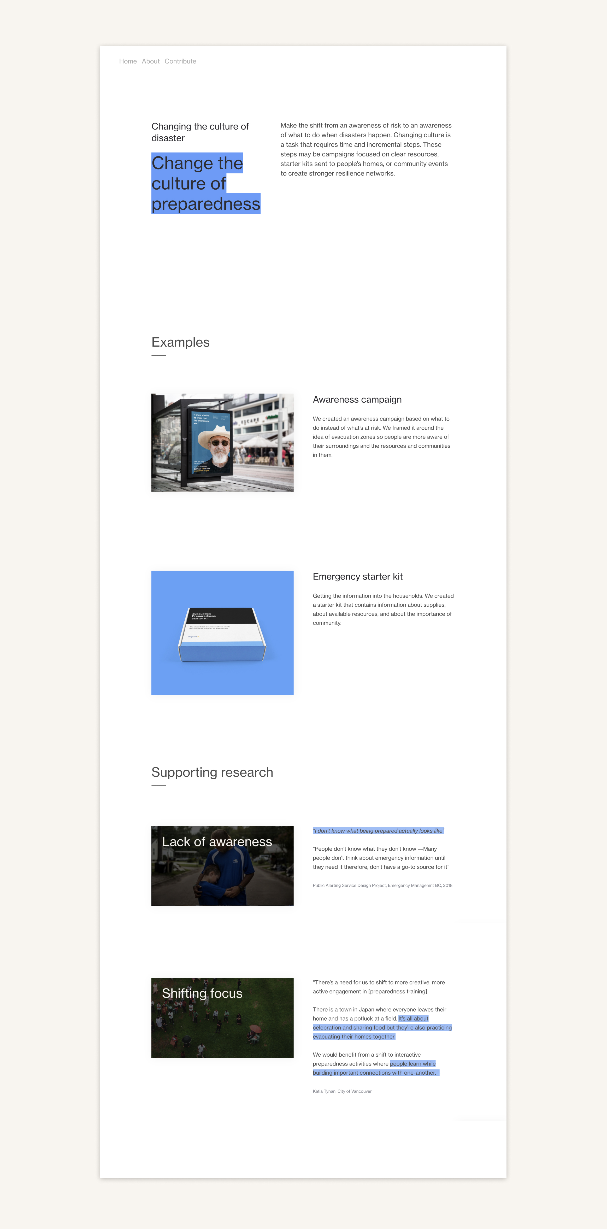
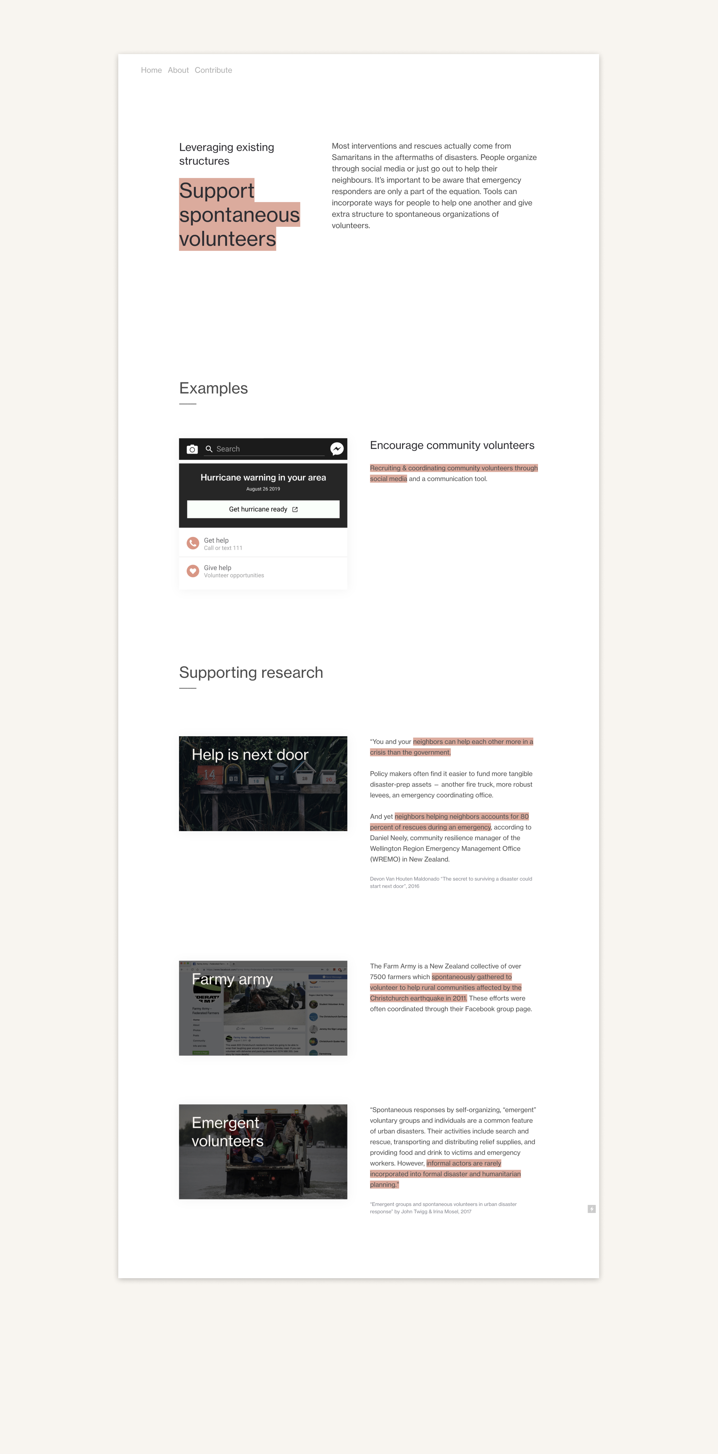
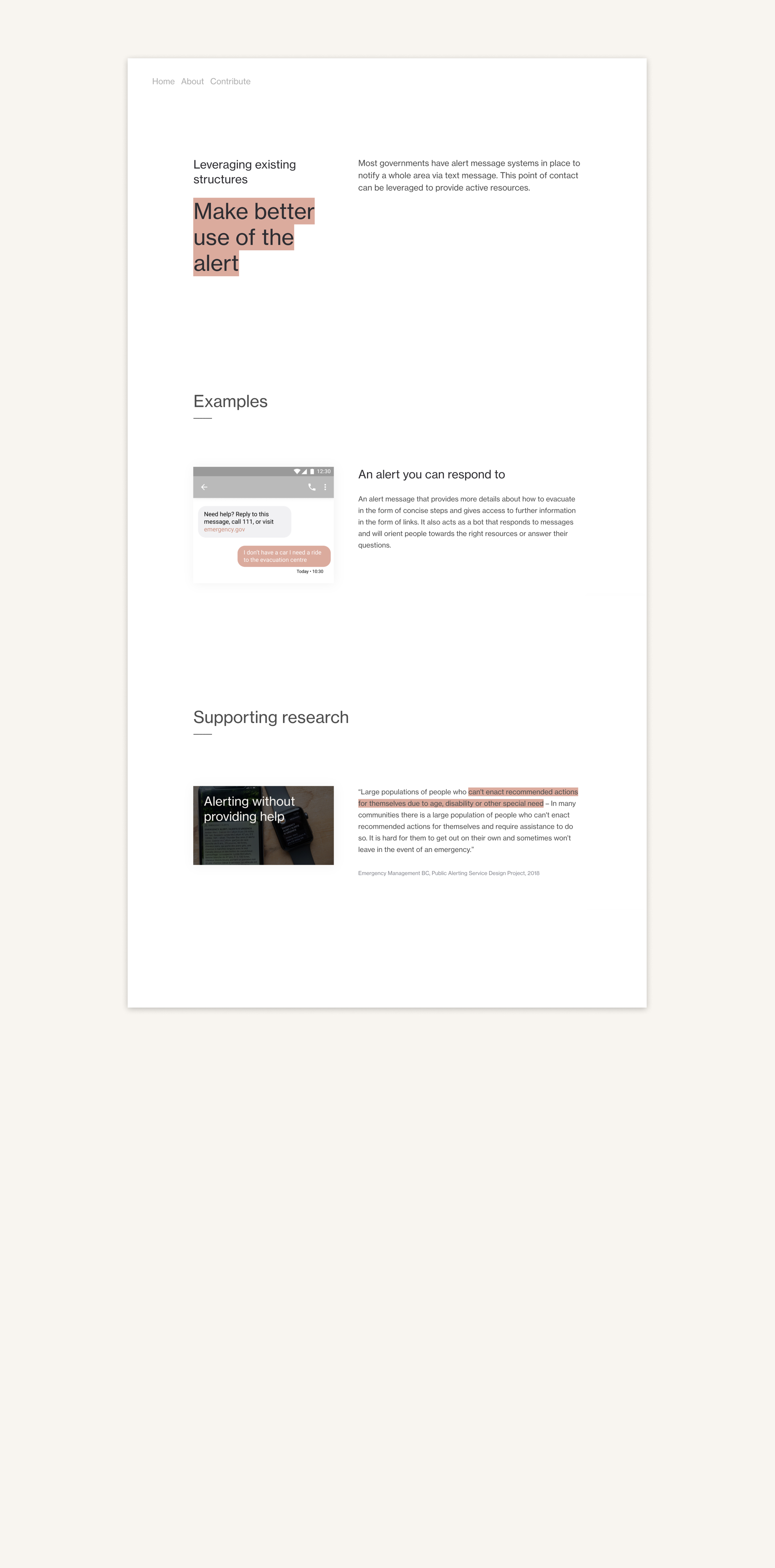
Community Resilience
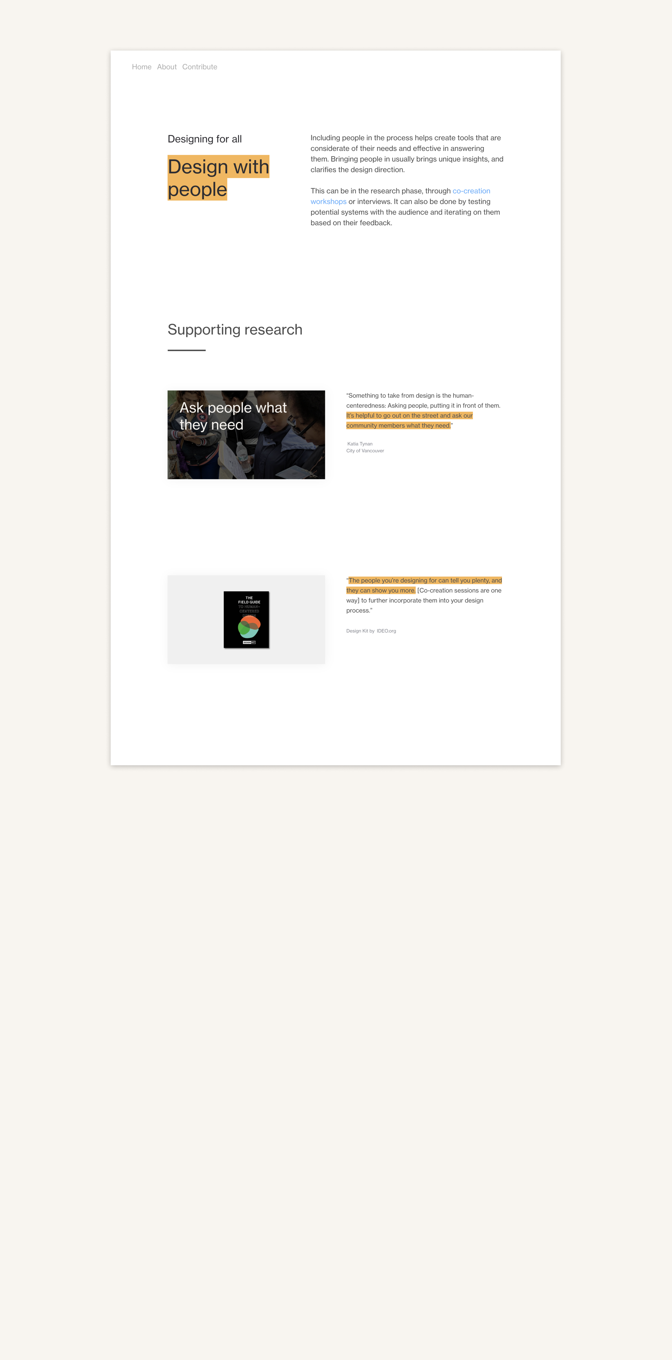
We heard emotional stories about people in communities coming together to help each other in times of disaster. One of our biggest learnings was about
the value of local knowledge, community networks, relationships and communication
during an emergency.We looked at how we could intervene earlier on by building awareness and changing the culture of preparedness far before a disaster happens in order to
create more resilient communities.


Researching the journey further
Because
it’s hard to test on or access people in these situations,
it seemed difficult to know how things actually go down; what the journeys are, the decisions, the emotions, and challenges. We learned a lot from people who were sharing their stories retrospectively, but it didn’t reflect the step by step journey.We found YouTube vlogs were a good way to get the whole journey;
we watched over 7 hours of evacuation and sheltering in place stories from dozens of diverse individuals and families.
We mapped these vloggers’ journeys and identified the steps, pain points, decisions, and emotions.
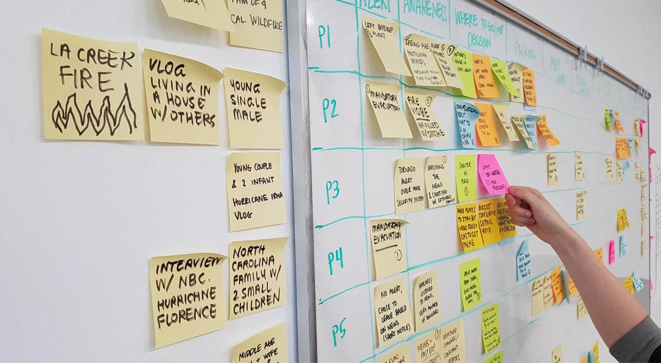
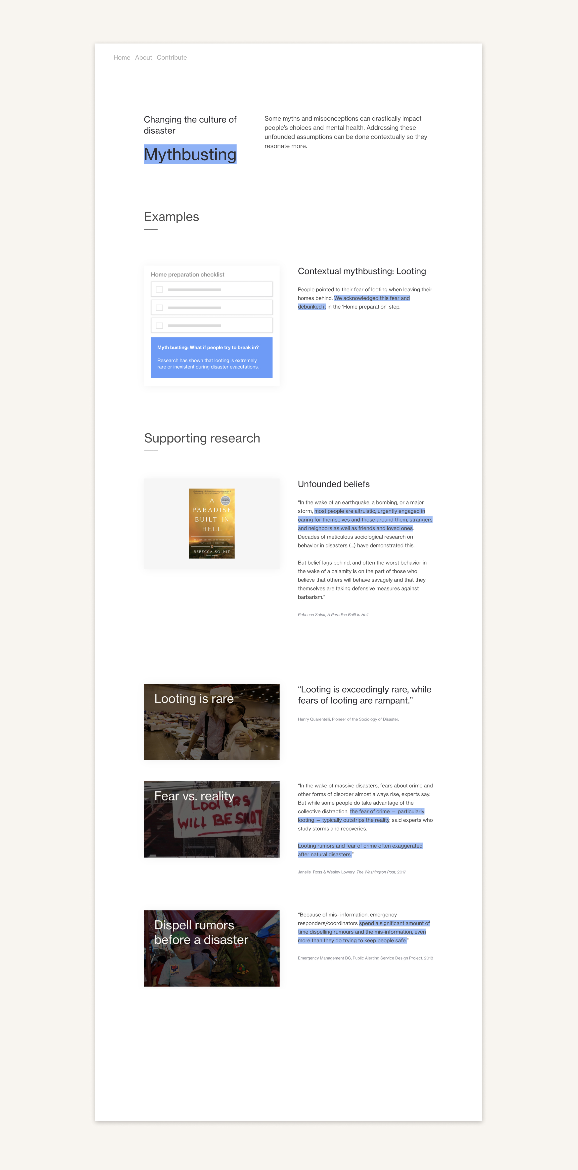
We found patterns:
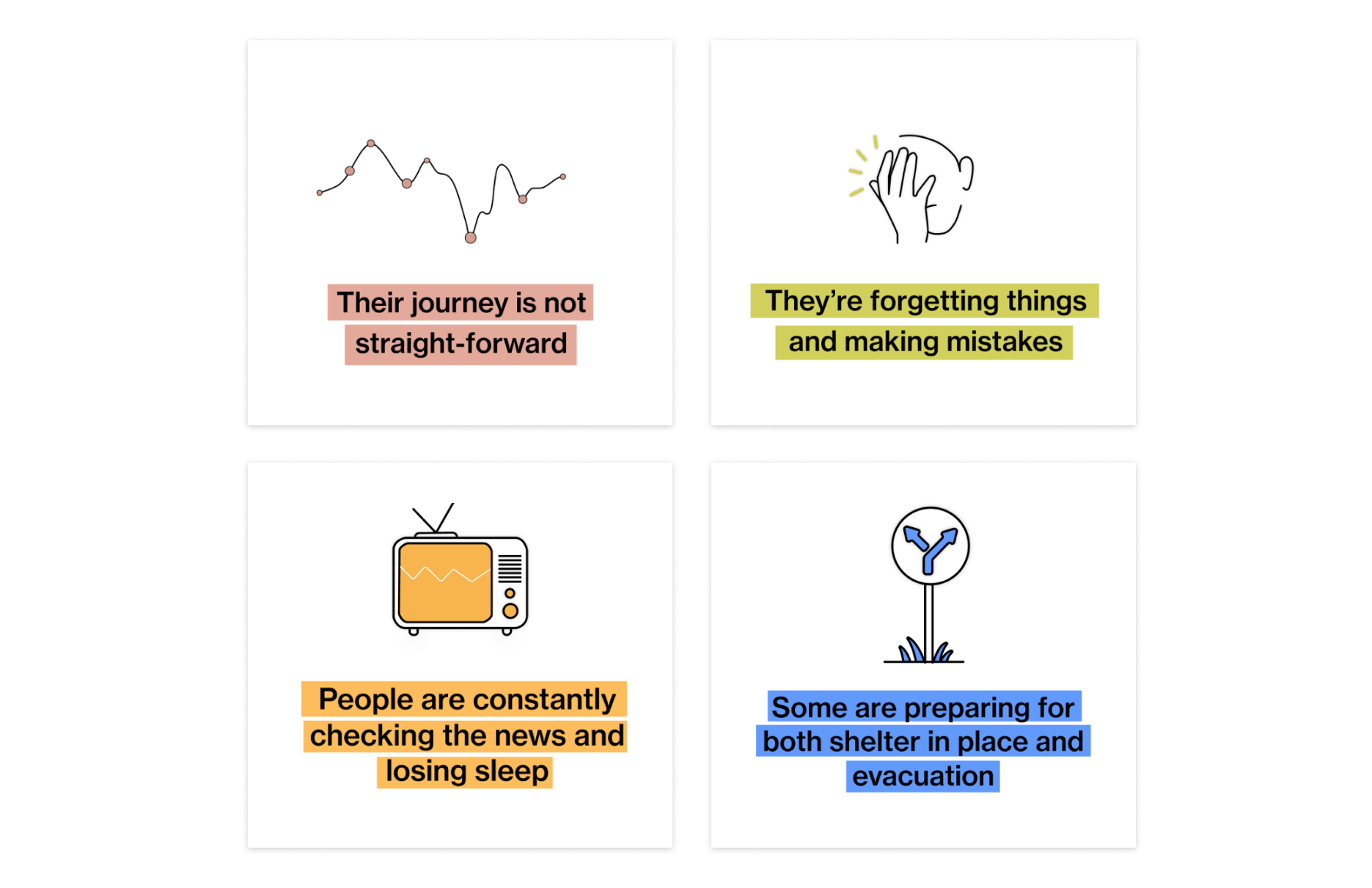
Through the videos, we realized that by focusing on evacuation,
we were ignoring the broad range of people that didn’t need to evacuate,
but were in a hurricane corridor. These people would be asked to “shelter in place”, meaning staying home while the hurricane passes. To do so, they would need supplies and need to prepare their homes, they would have a curfew, and might eventually need to evacuate. They too would have to go through several steps and decisions to ensure safety.We created a new tool that was more aware of these considerations.
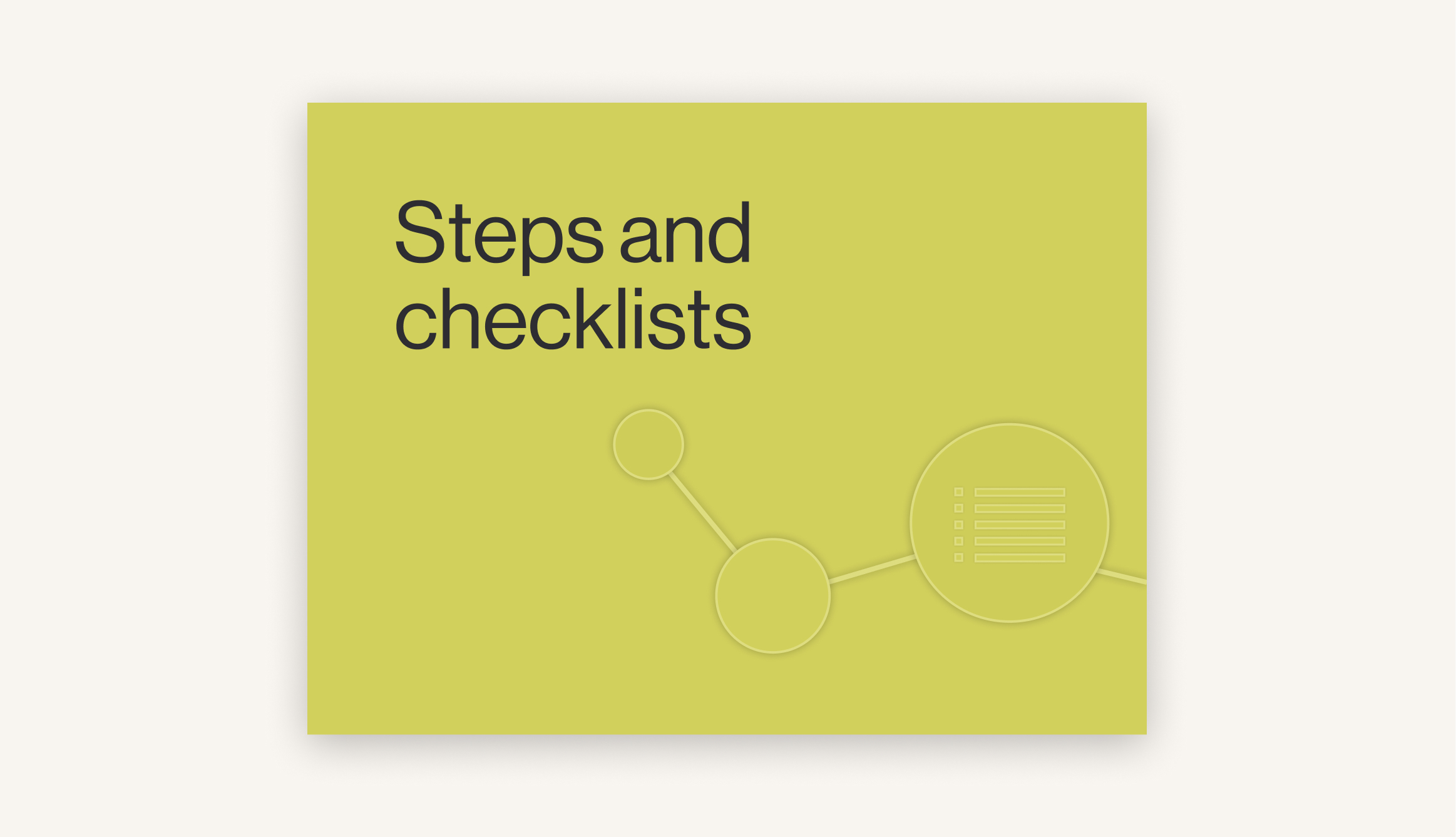
Although people’s journeys weren’t straightforward, they would all go through similar stages. We answered this by organizing these stages into clear steps to make them appear more manageable. This layout would also help with stress and create a comprehensive dashboard. We organized some of the content through checklists that are customizable so people don’t have to rely on their own memory. Checklists also offer the opportunity to put forward our own recommendations. We answered the need for updates by offering clear, local sources for it.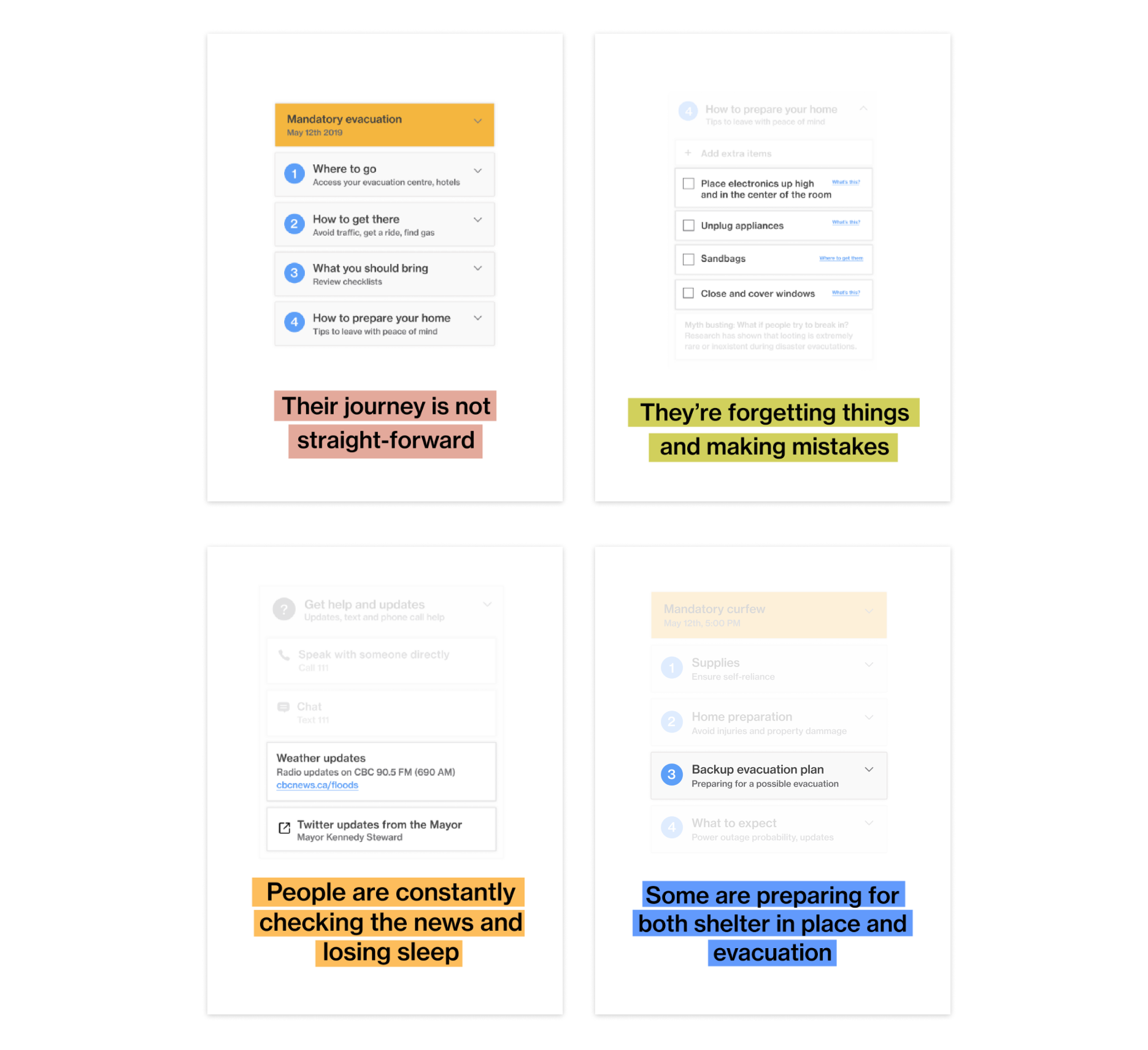
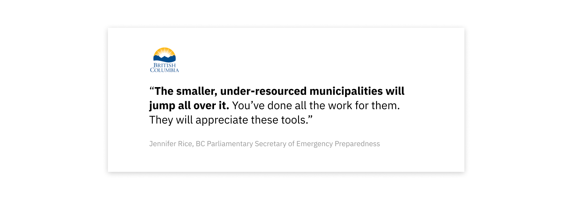
Where is the real value?
We had made a series of tools, they were polished and user tested.
But was this useful for the real world?
Could every municipality put this much resources into a service? Have a population that would respond to our high-level tool? We realized that what the municipalities could really use here, was what’s behind this tool: The guiding principles, the research.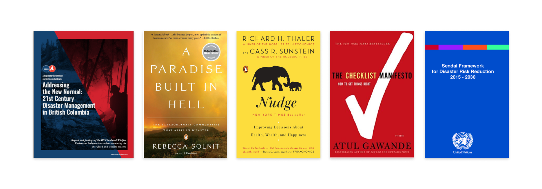
Making a principles library
We put together all of our research informed insights and created a design principles library using our own user-tested designs to illustrate them. 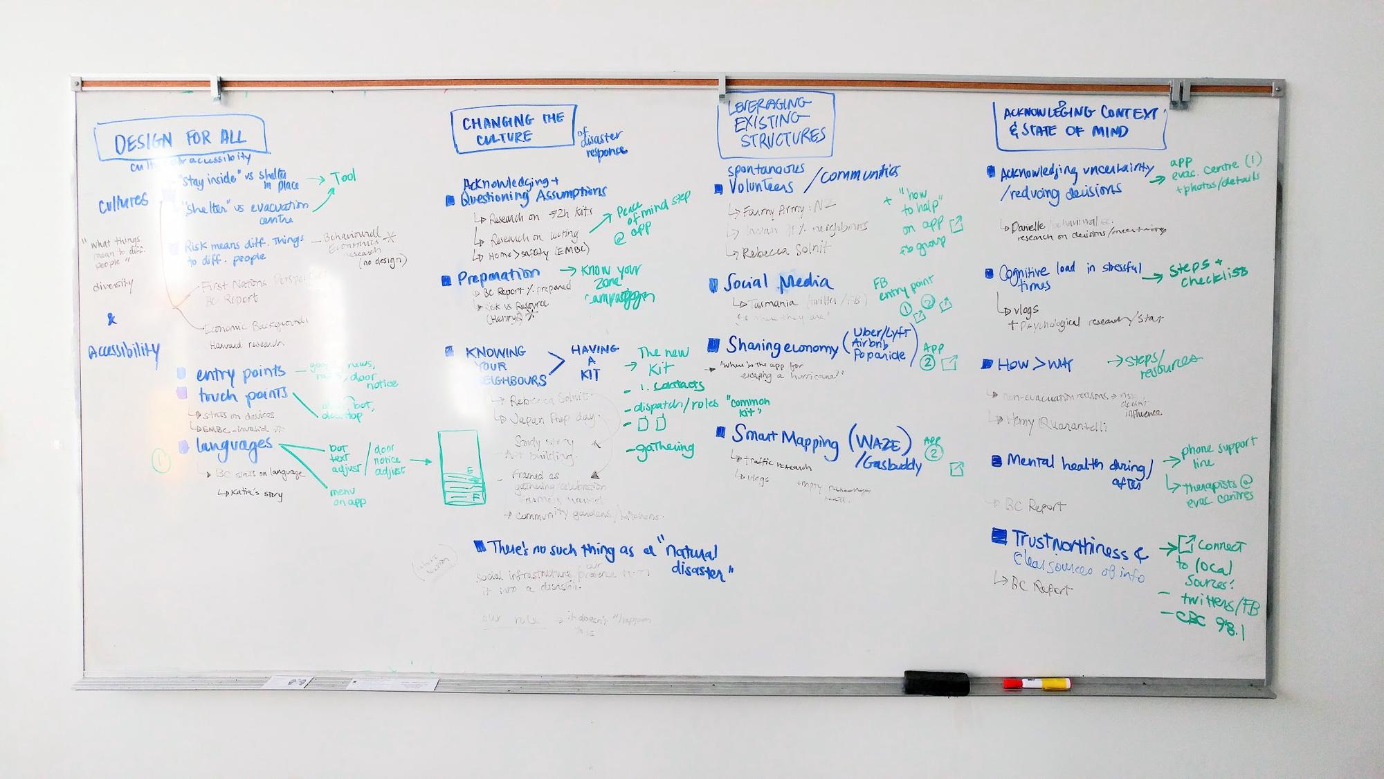
Abstract UI
We simplified these interfaces to make the most relevant features salient,
through blockframing.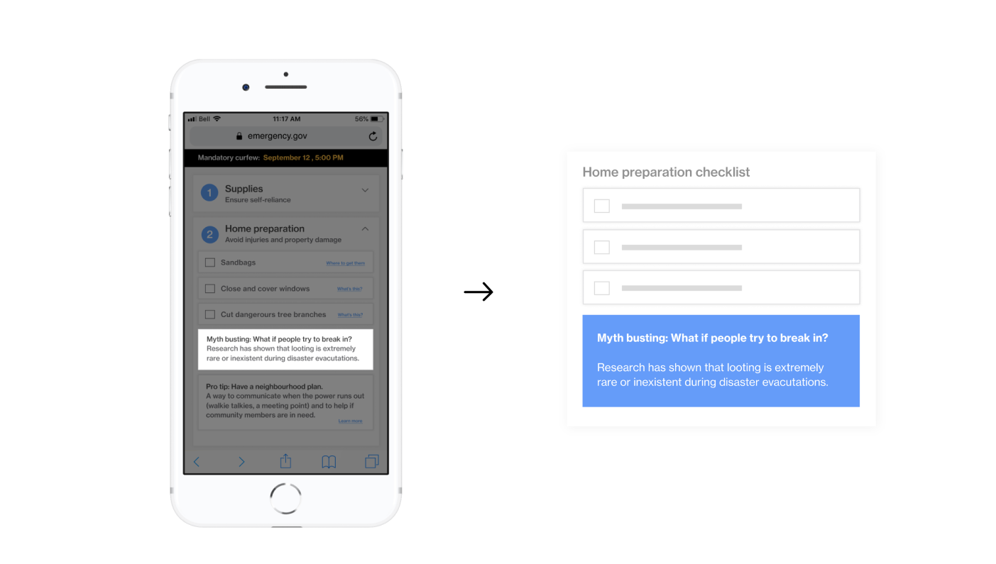
How this meets our goals
Our initial goal was to use interaction design to improve people’s decision making in disaster situations. The website we created helps teams incorporate interaction design insights (through user-centered principles backed by research) into their systems, which in turns makes these teams influence positively the decision making of the populations they’re planning it for.
Takeaways
The impact of showing up weekly for 8 months
Working through doubt as a team
Leveraging each member’s skills
We got to witness the scale and quality of work that can be attained through months of continuous work. We learned to navigate a space that had no easy answer and to constantly question our own directions to ensure we’d create something actually useful. It created moments of doubts, which we embraced and pushed through by reaching out to professionals and ideating/researching further.
Working as a team added a level of complexity in the process, requiring strategy and alignment, which we smoothly handled. Our team was productive, well-rounded, and we had fun throughout. We leveraged each member’s skills to their fullest and produced a number of deliverables that are reflective of the team’s talents and work ethics.
Working as a team added a level of complexity in the process, requiring strategy and alignment, which we smoothly handled. Our team was productive, well-rounded, and we had fun throughout. We leveraged each member’s skills to their fullest and produced a number of deliverables that are reflective of the team’s talents and work ethics.


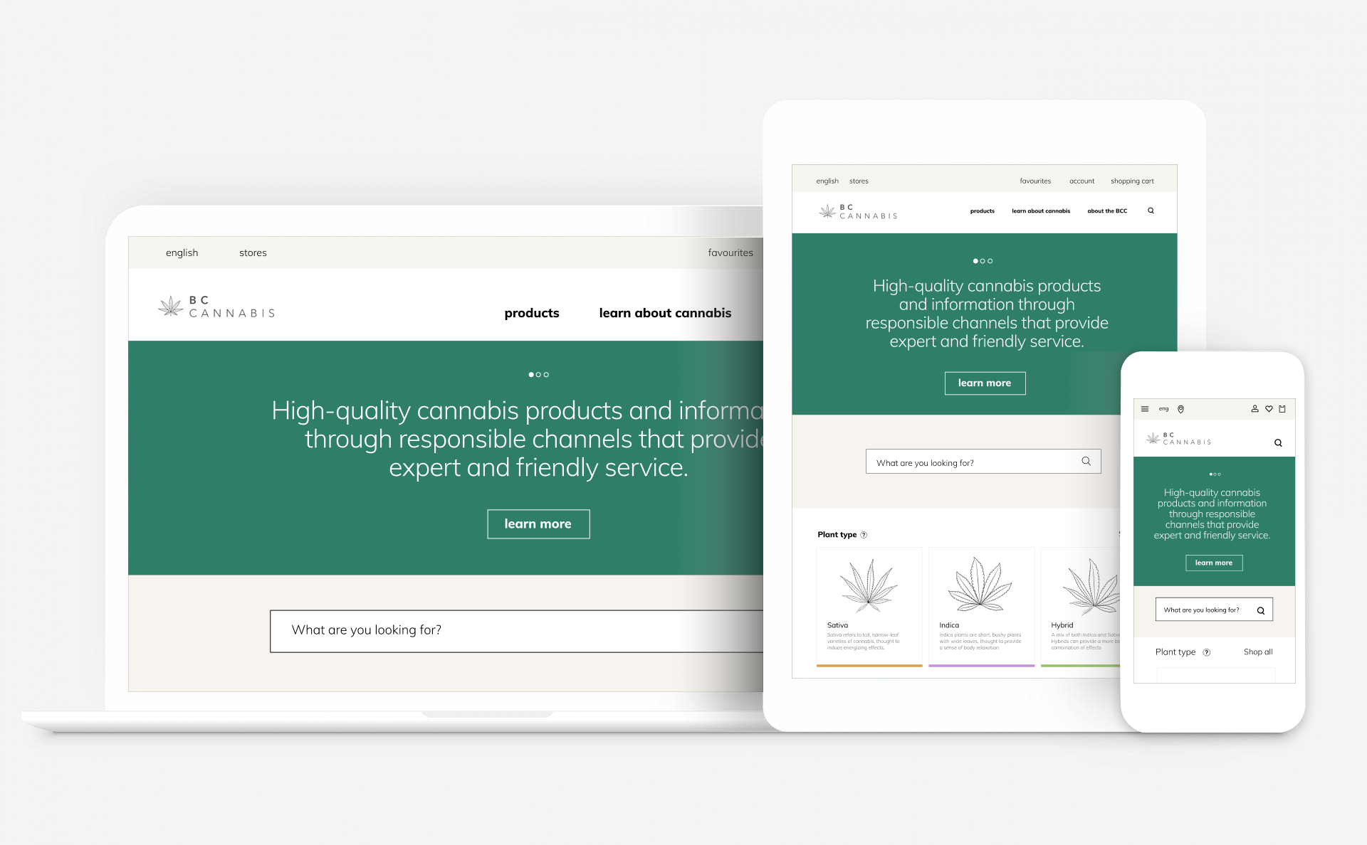
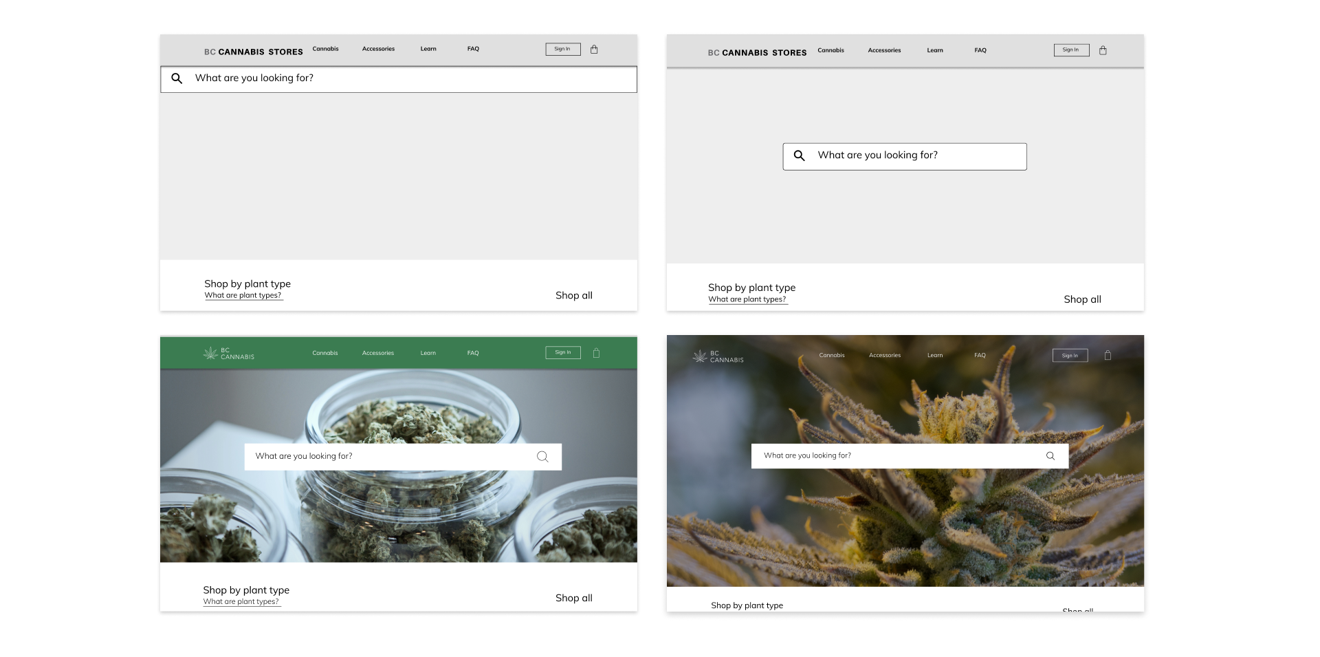
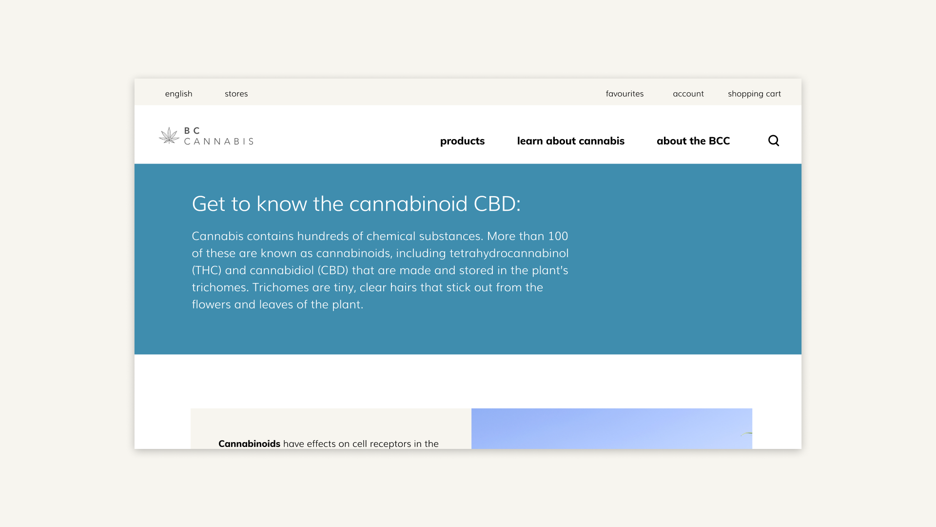
BC Cannabis Redesign
BC Cannabis Stores is a crown corporation retail and ecommerce company that distributes cannabis products in British Columbia.
We developed a
cohesive and consistent brand identity
to better reflect professionalism and trust for an industry that is still stigmatized despite legalization in 2018. The service was designed to respond to awidely varying user experience level by educating its users contextually.
Designers:
Brit Williams, Madigan Macdonald (Communication Design), Halim Lee (Communication Design)
Role:
Team lead, UX Design
Through interviews with a former cannabis dispensary employee we identified a
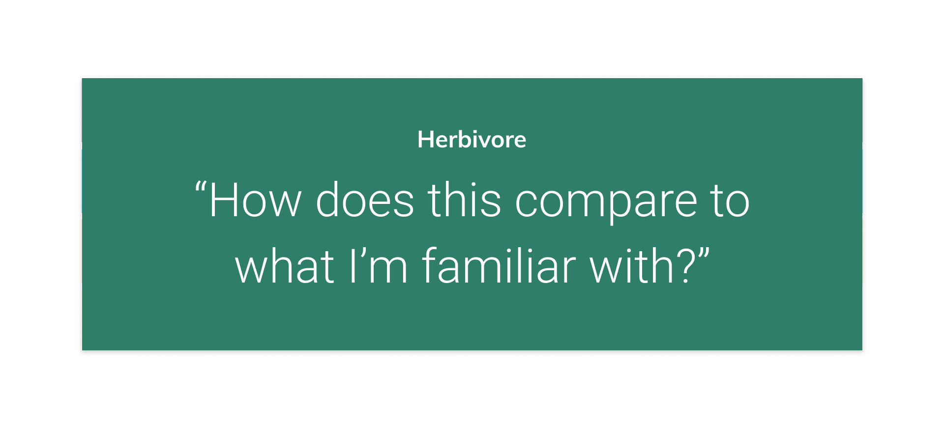
spectrum of users with varying experience levels.
Based on our findings we developed personas to refer back to throughout the project.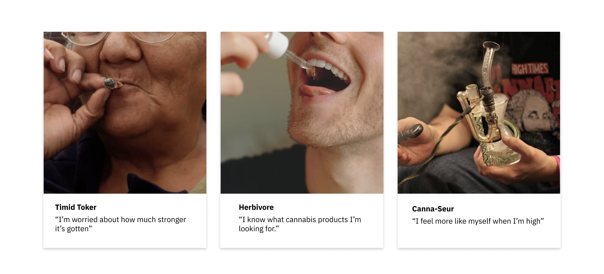
Getting to know our users
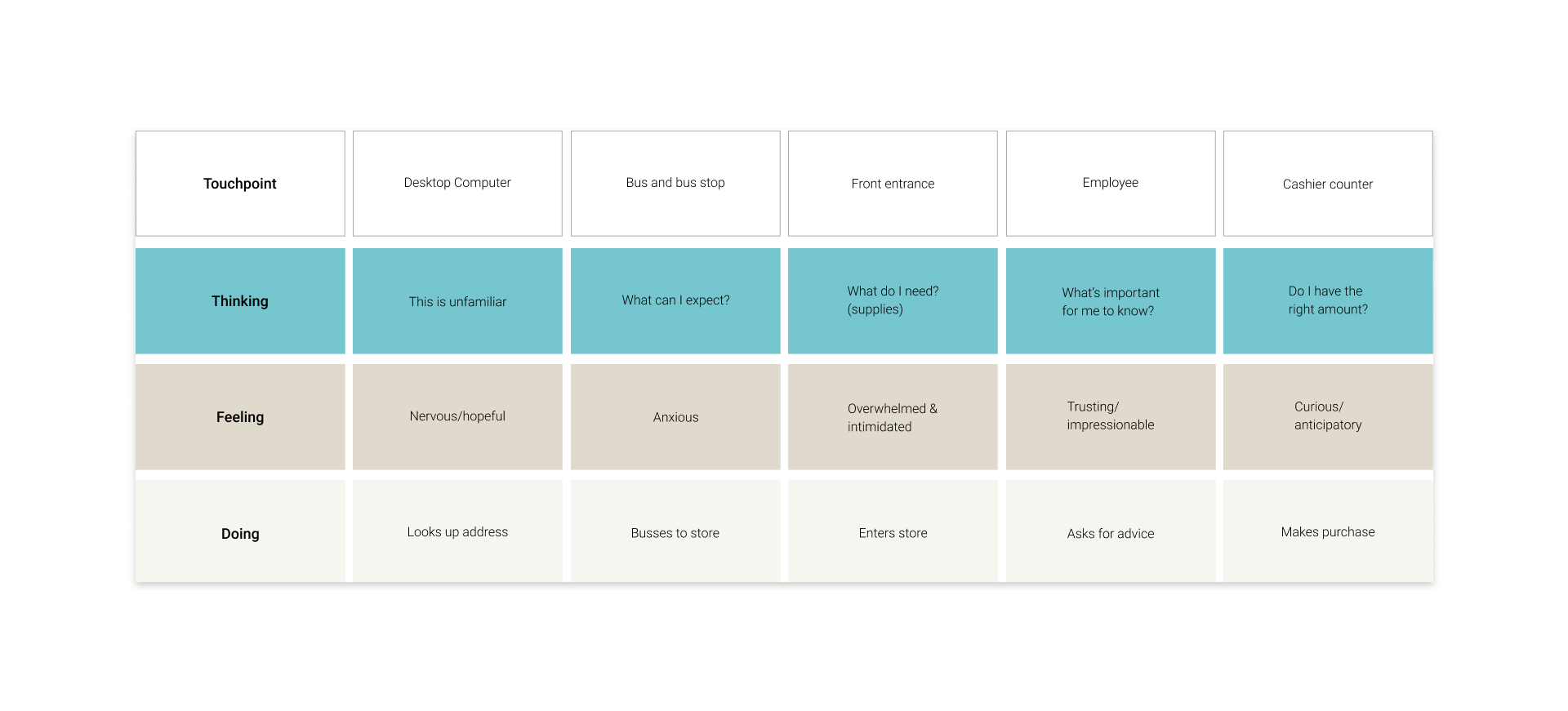
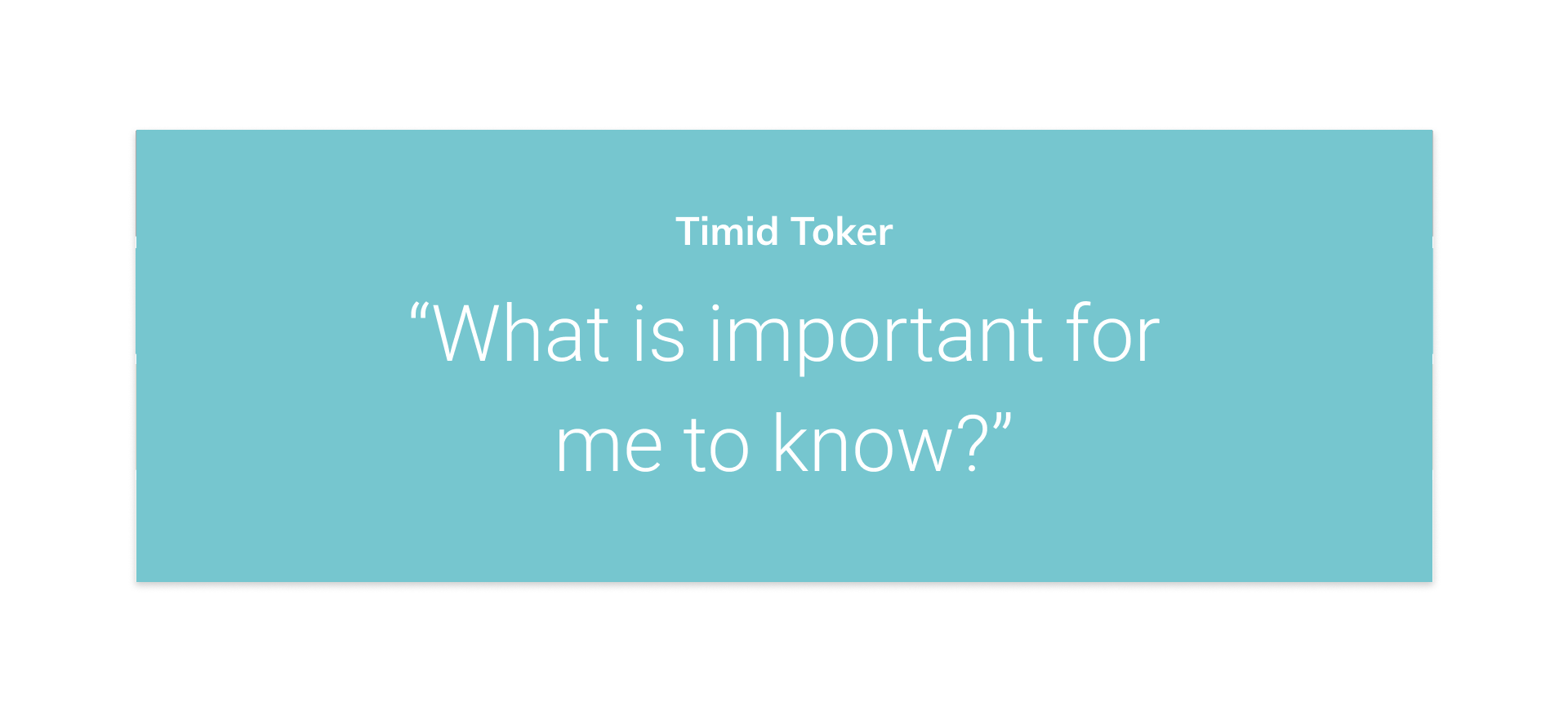
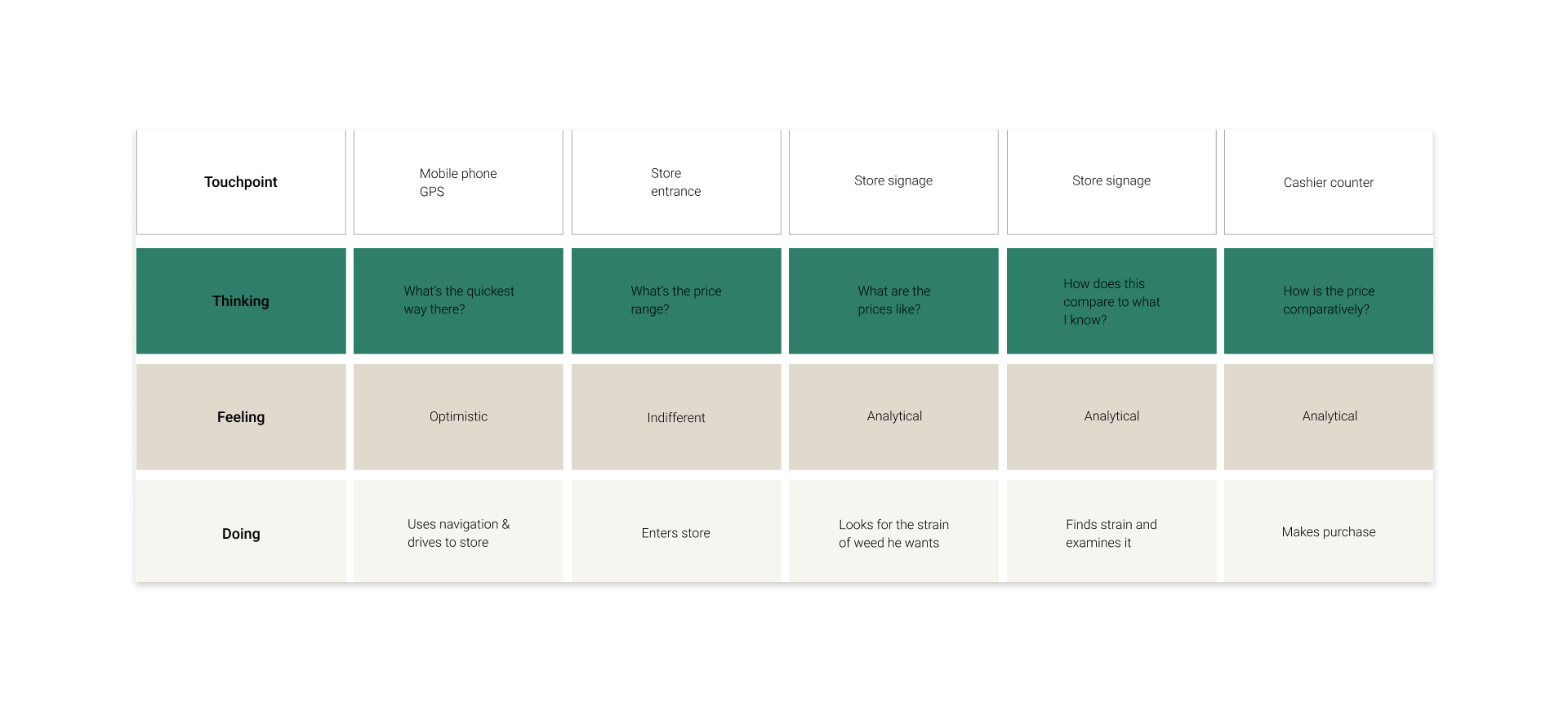
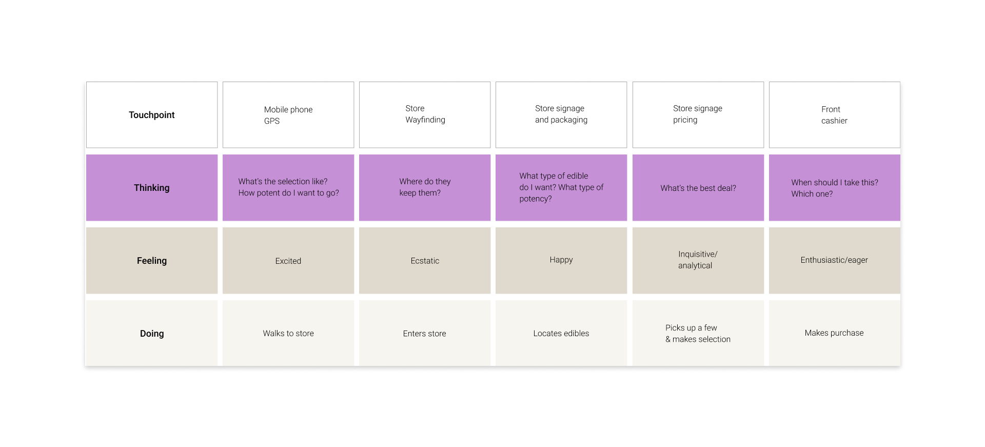
Mapping our user’s journeys allowed us as designers to visualize communication channels and identify opportunities for a better experience.
Mapping our user’s journeys allowed us as designers to visualize communication channels and identify opportunities for a better experience.

Process
We created scenarios for our users and sketched possible solutions through design sprints.
We created scenarios for our users and sketched possible solutions through design sprints.
Our goal was to help our users learn about, explore and find products more effectively
on the BC Cannabis ecommerce store.Teach Users Contextually
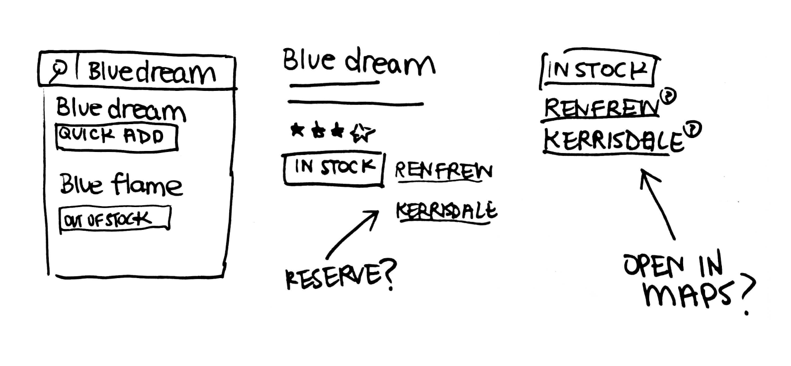
Give users access to information and learning as they navigate the website.
![]()
Give users access to information and learning as they navigate the website.
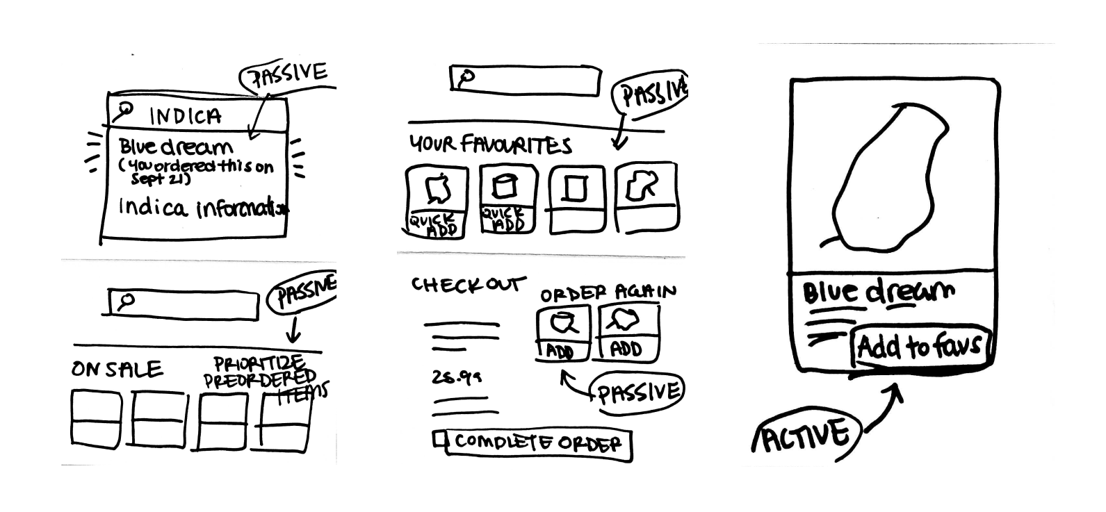
User Centered Personalization
Remember users preferences and make recommendations.
![]()
Remember users preferences and make recommendations.
Bridging Digital to Physical
Create a seamless interaction between the website and the retail stores.
![]()
Create a seamless interaction between the website and the retail stores.
Shifting the Culture
In order for the brand to
better reflect professionalism and trustworthiness,
through a series of iterations and critique we refined the visual design and tone of voice of the website.We moved away from the Cheech & Chong, 1970’s era cannabis graphics and toward a more
reputable design indicative of a Crown Corporation retailer.

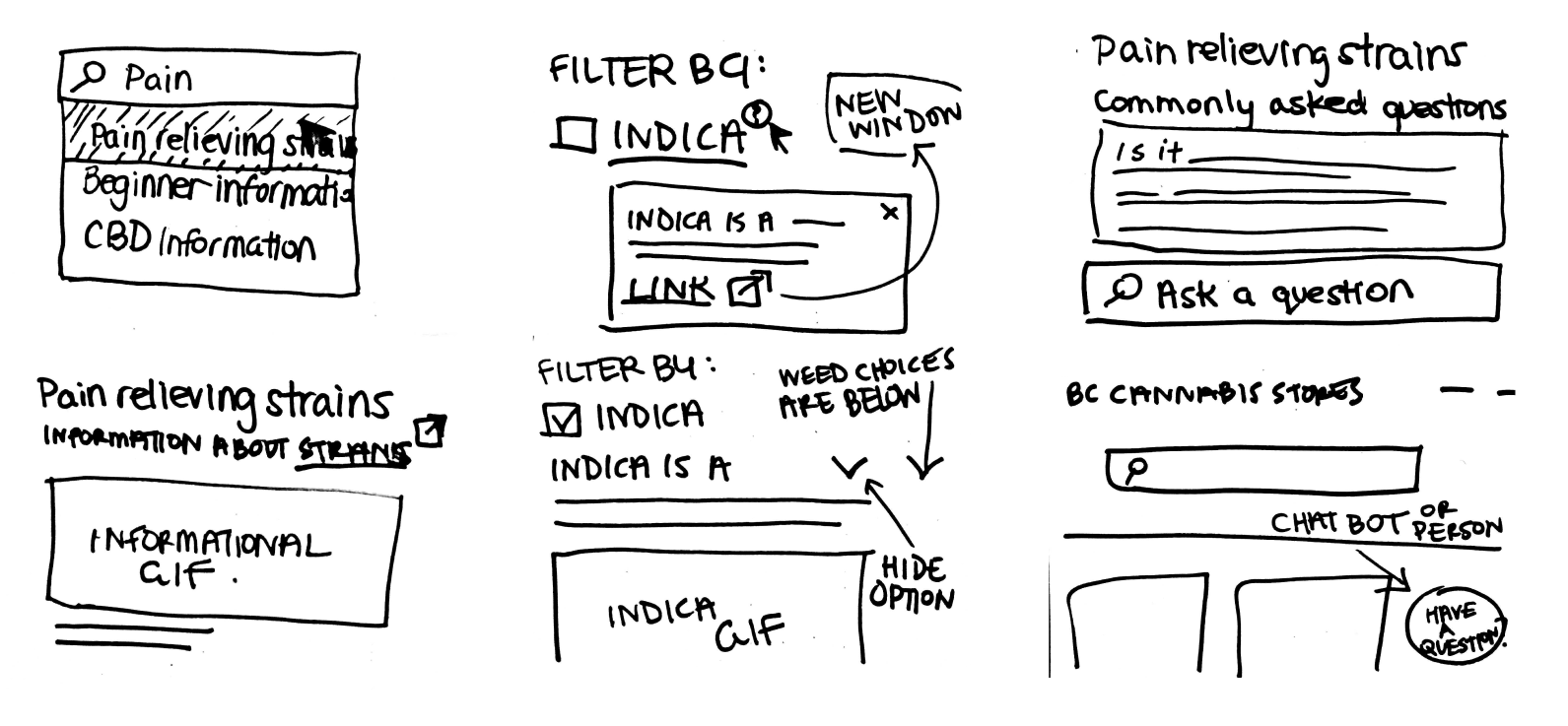
Teach users contextually
To help inform our timid or inexperienced users we
baked learning into every page.
Users can easily get informed about what they’re interested in without having to leave the website.
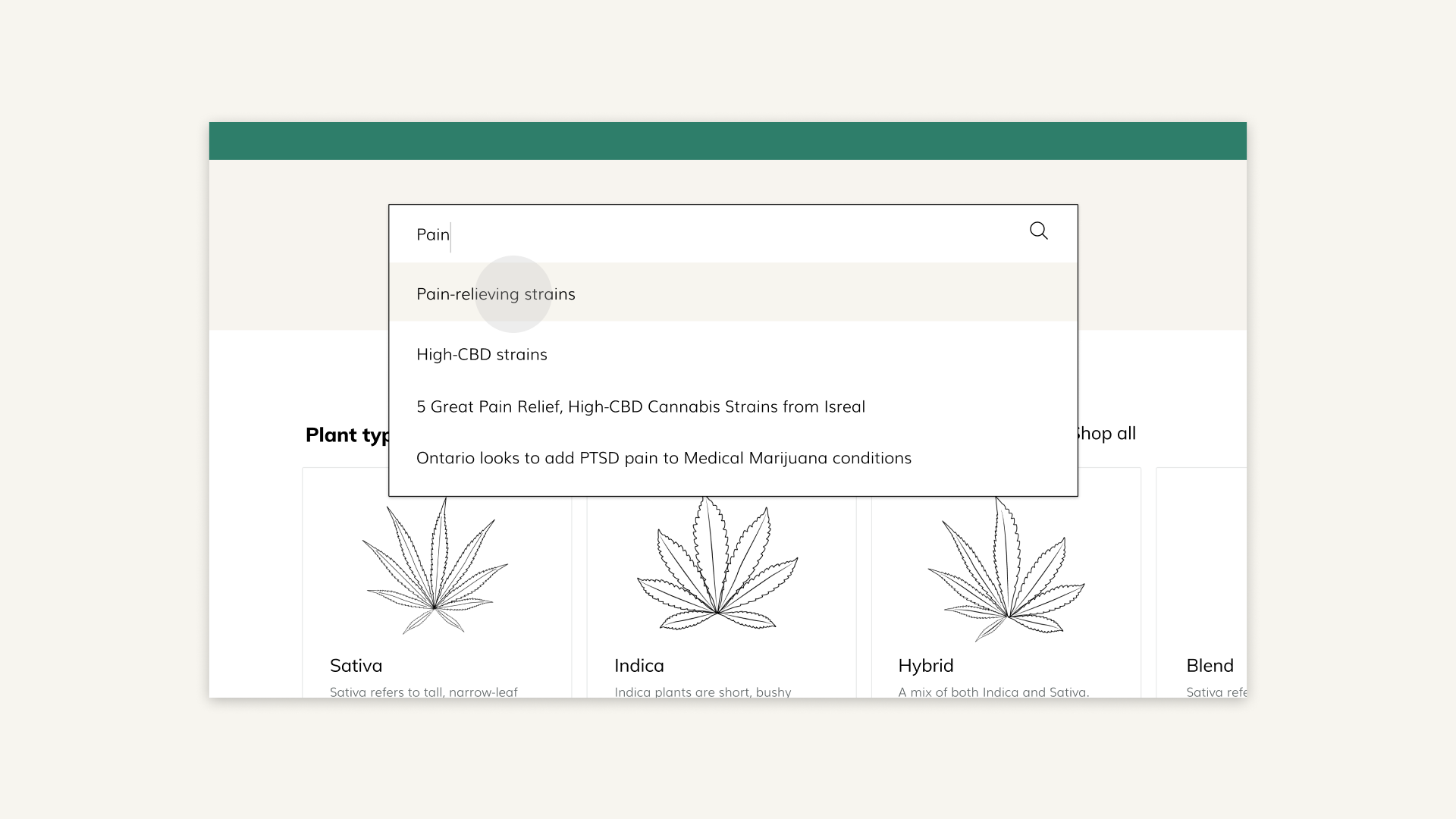
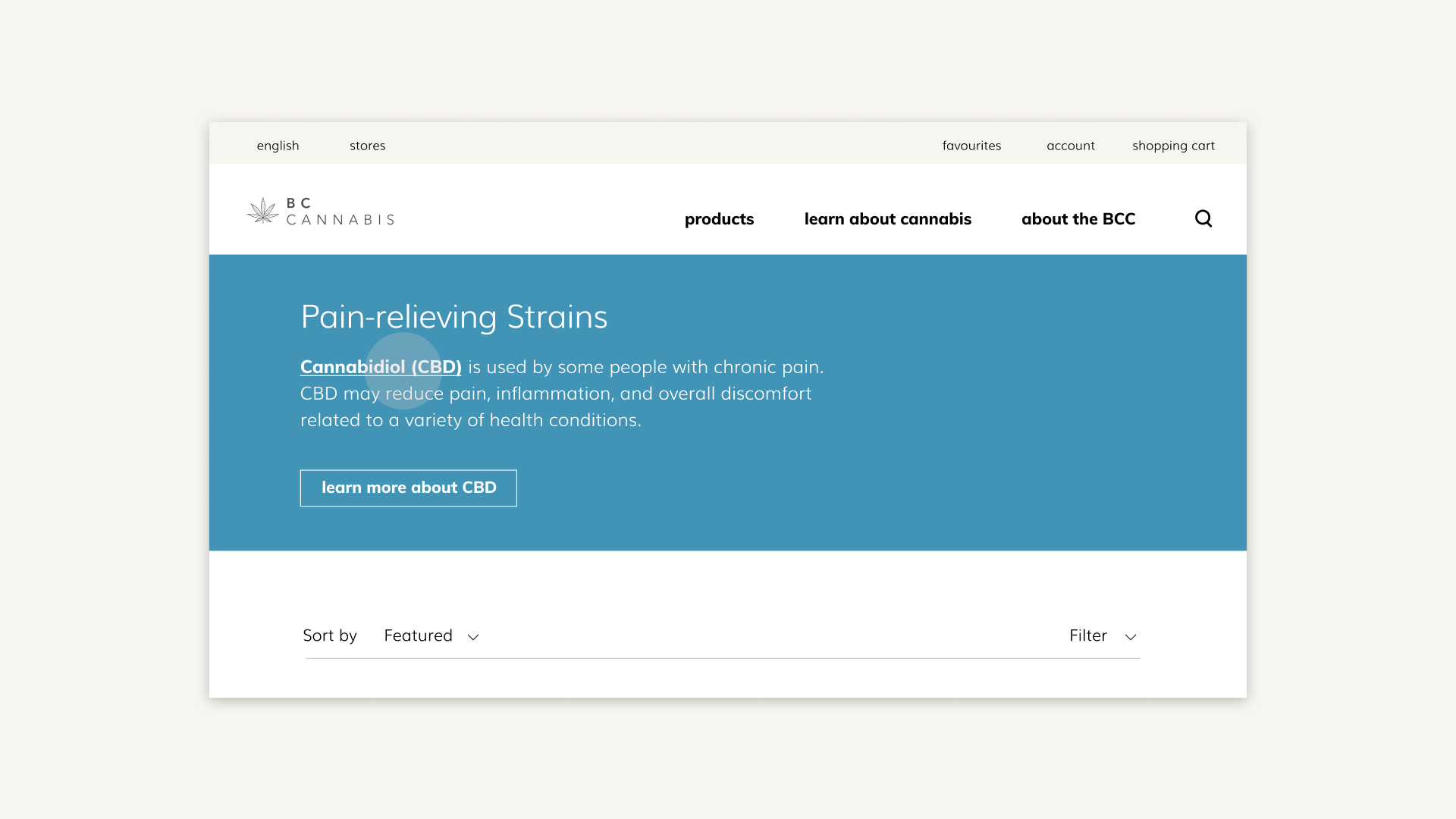
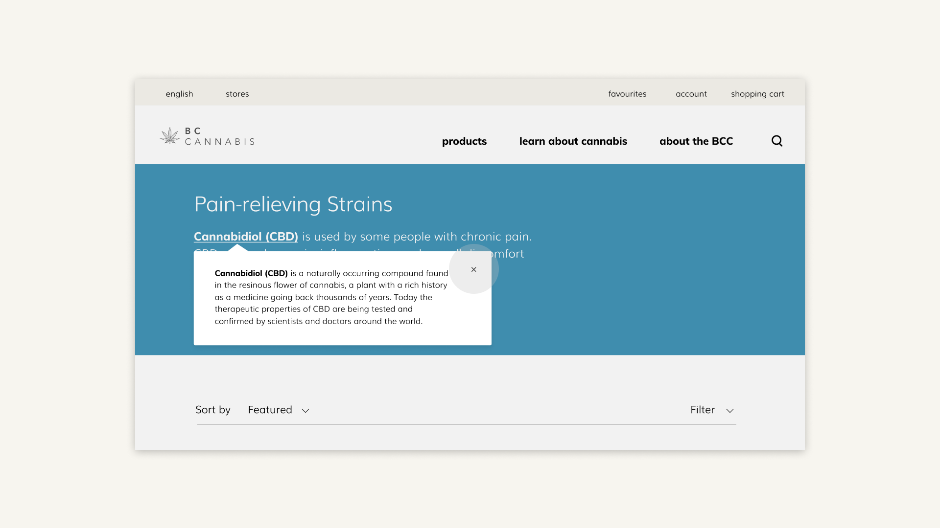
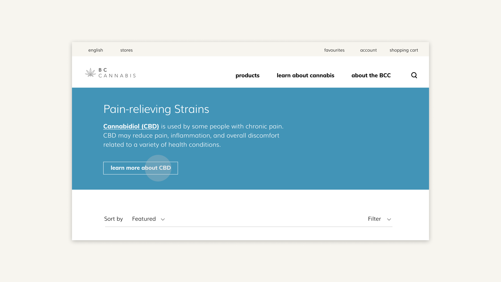
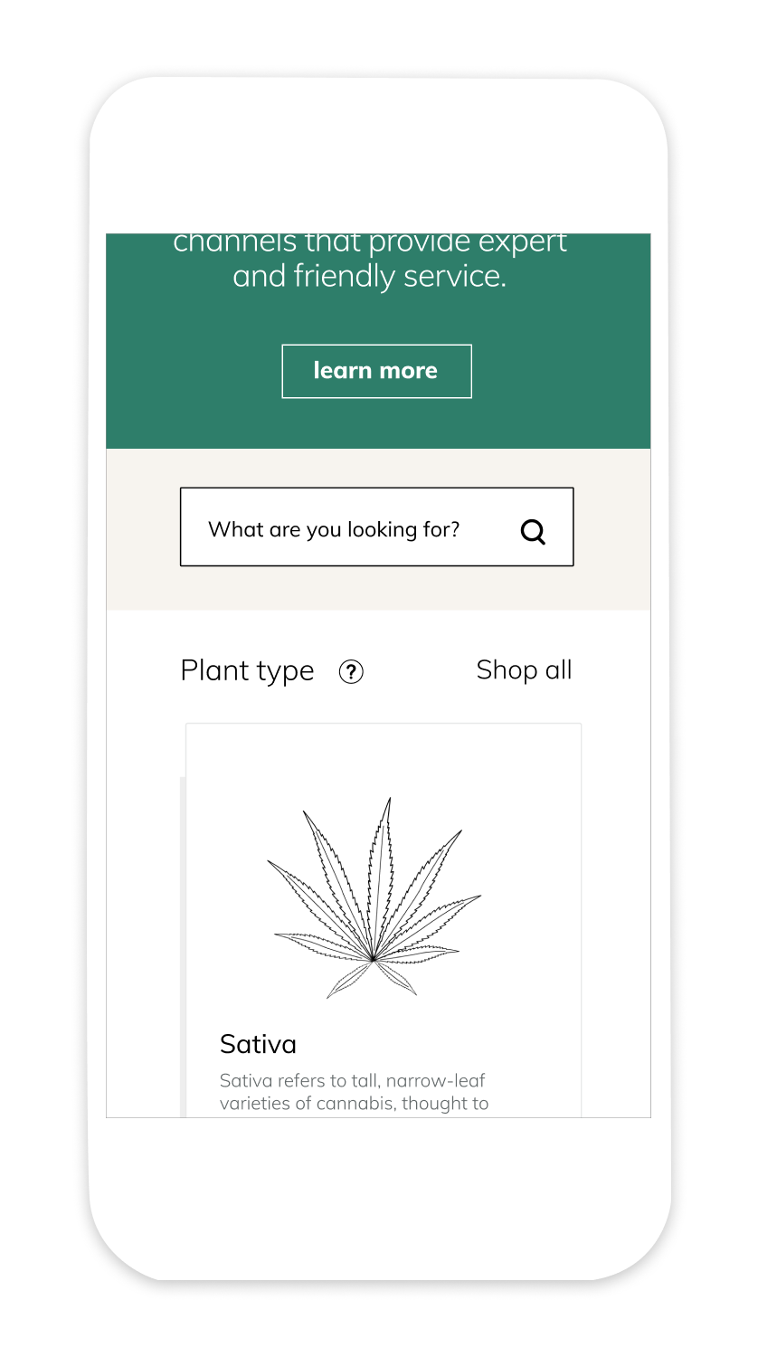

Let users search by their specific needs
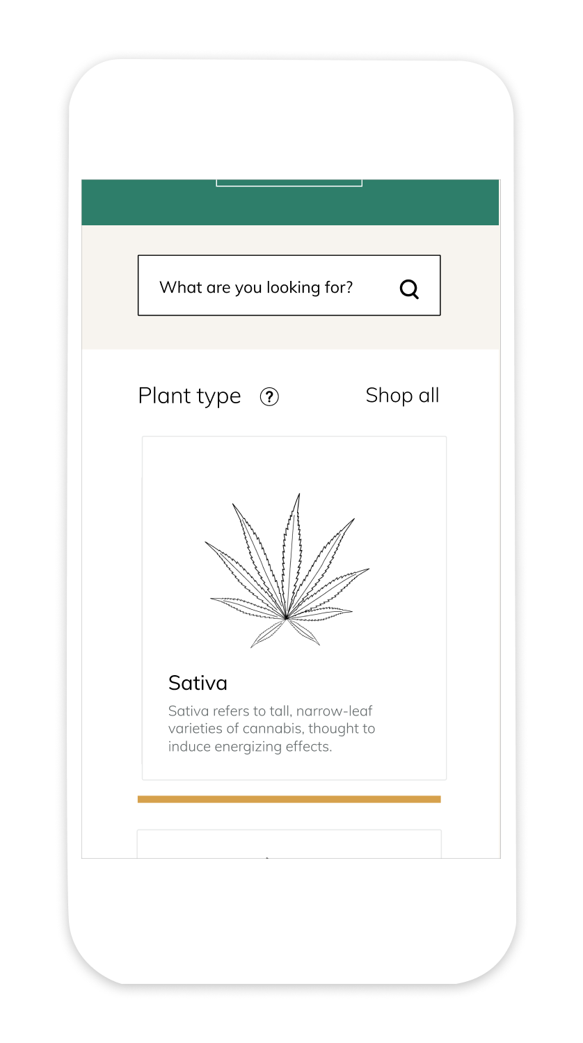
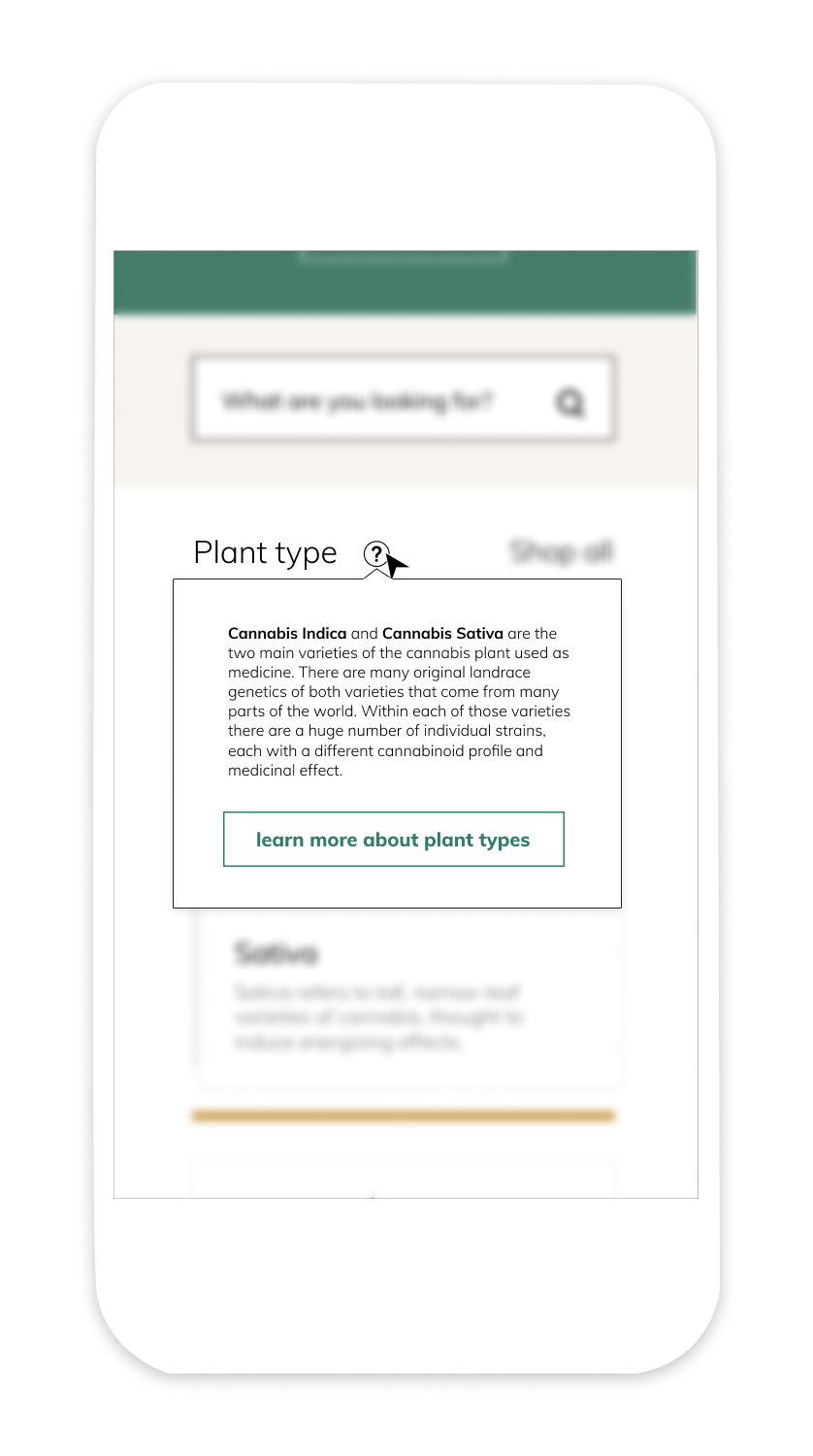
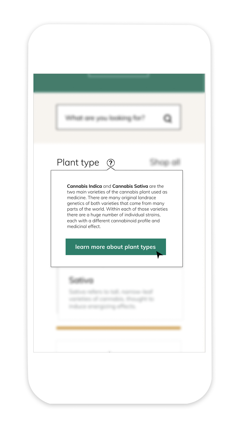
Learn a little, or a lot
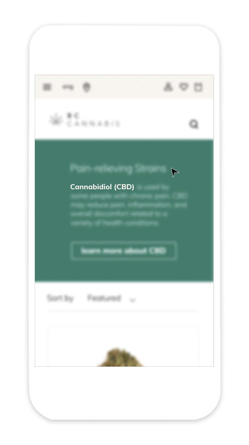
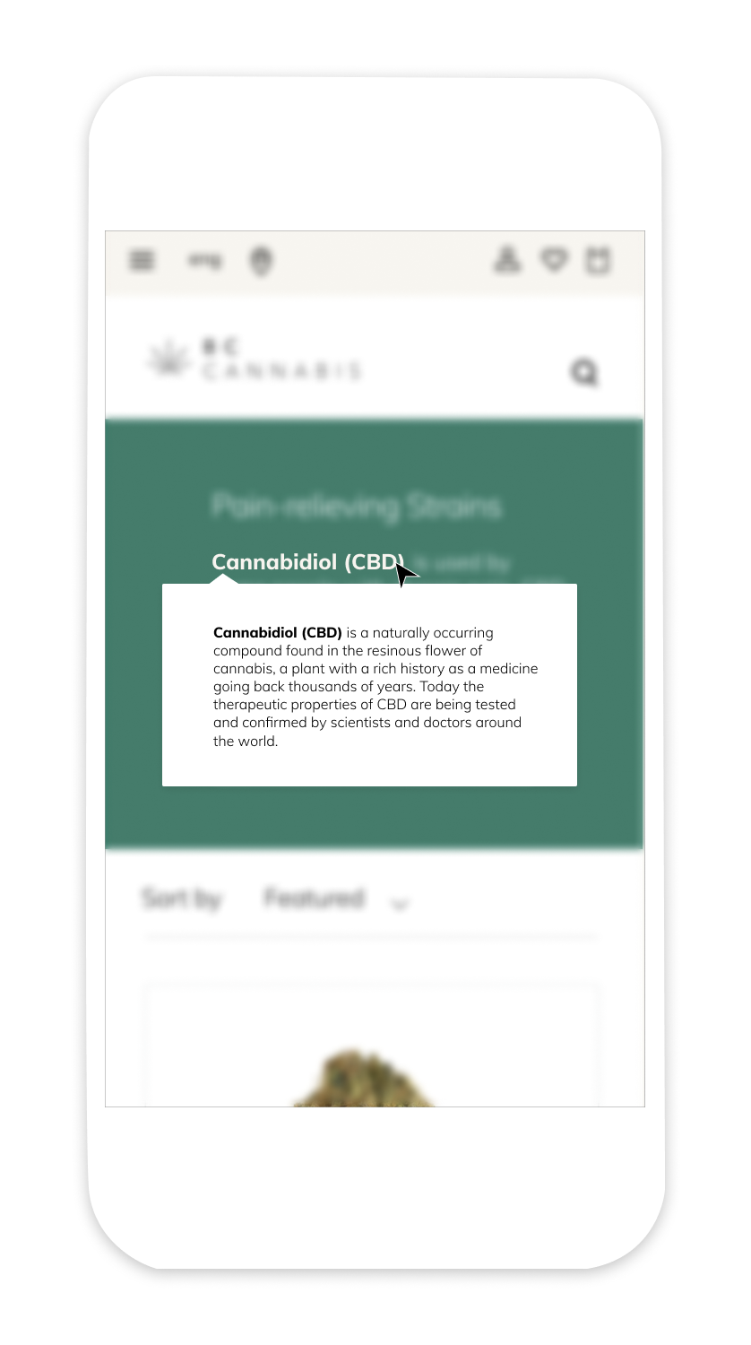
Bake learning into every page
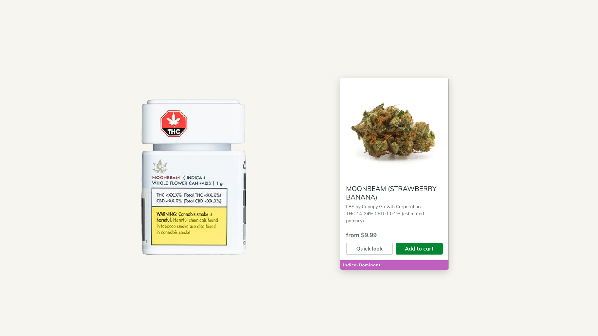
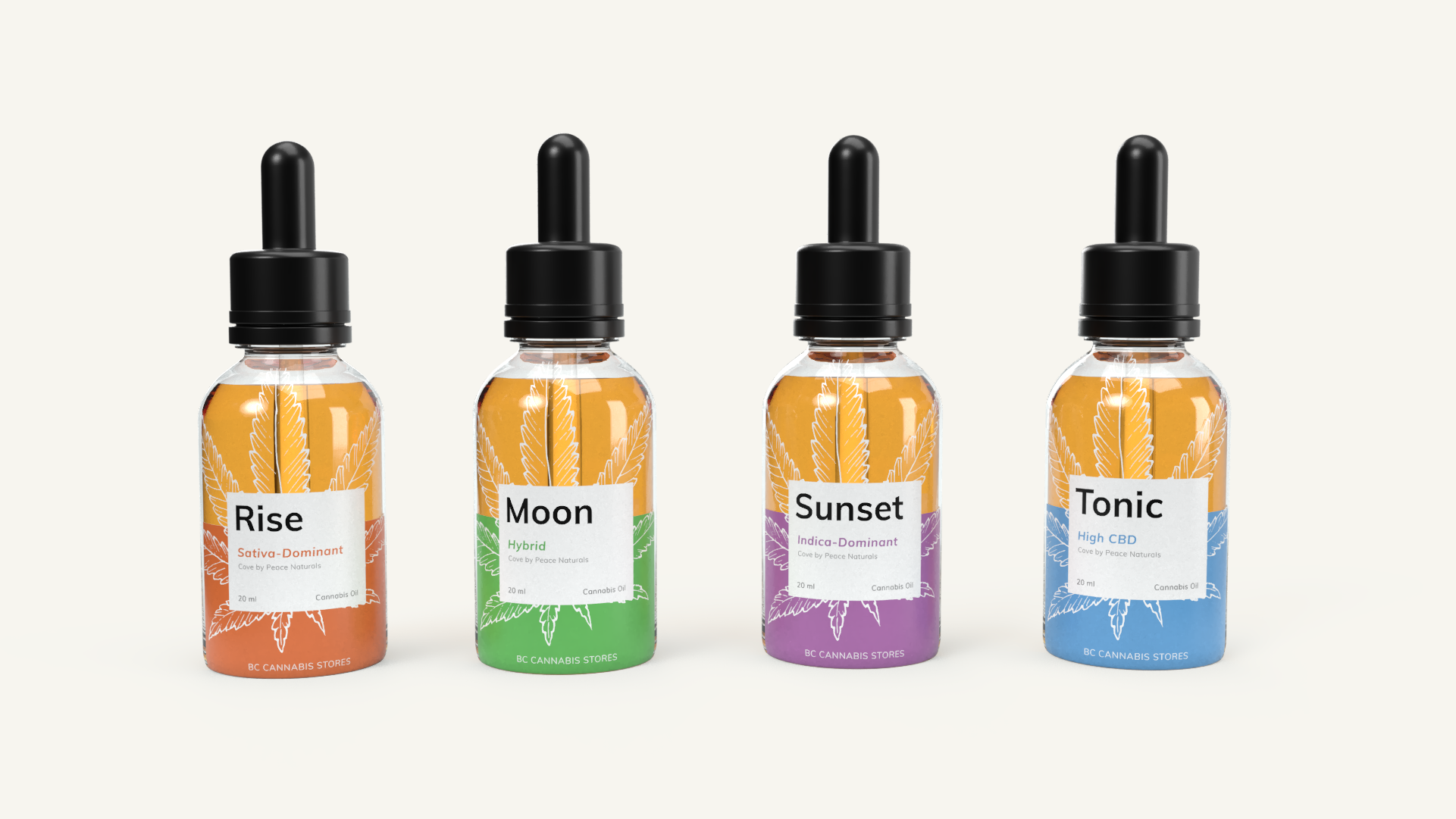
Bridging Digital to Physical
We leveraged the existing color coding for Cannabis type (Indica, Sativa, Hybrid, CBD) on the ecommerce store. By redesigning the packaging under these guidelines we created better
We leveraged the existing color coding for Cannabis type (Indica, Sativa, Hybrid, CBD) on the ecommerce store. By redesigning the packaging under these guidelines we created better
continuity between the digital and physical touchpoints.


How this meets our goals
Our goal was to use design to help customers learn, explore and find items more effectively on the BC Cannabis Website, help the brand shift the culture and reflect professionalism and trust, and bridge the gap between touchpoints in their service. We leveraged the existing system of color coding by type across touchpoints, refined the visual design, and created opportunities for the users to learn and receive informed recommendations without leaving the website. This provides customers with the benefit of a service that is better positioned to meet the varying needs of the public.
Takeaways
The impact of clear weekly expectations and deliverables
Being resourceful about finding subject matter experts and research
Don’t reinvent the wheel: leverage existing structures
I lead the teams strategic design choices through group brainstorming and critique. I learned it’s important to establish early on what each person’s key strengths are, and what they would like to get out of the project. From there, creating work back schedules with clear weekly deliverables helped us stay connected as a group with limited time outside of class. It also ensured our class time was spent effectively by receiving plenty of feedback on our work.

Project
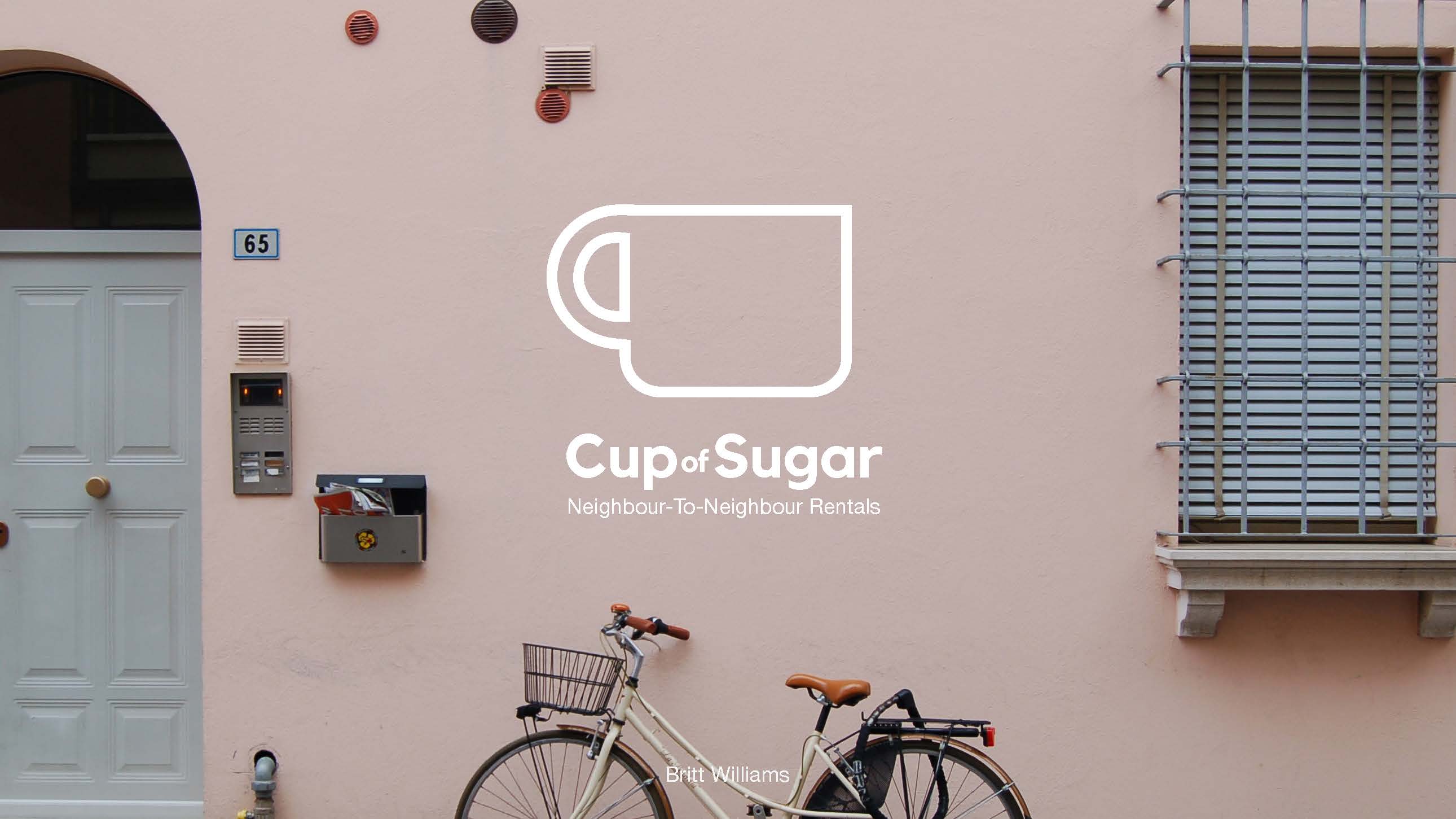
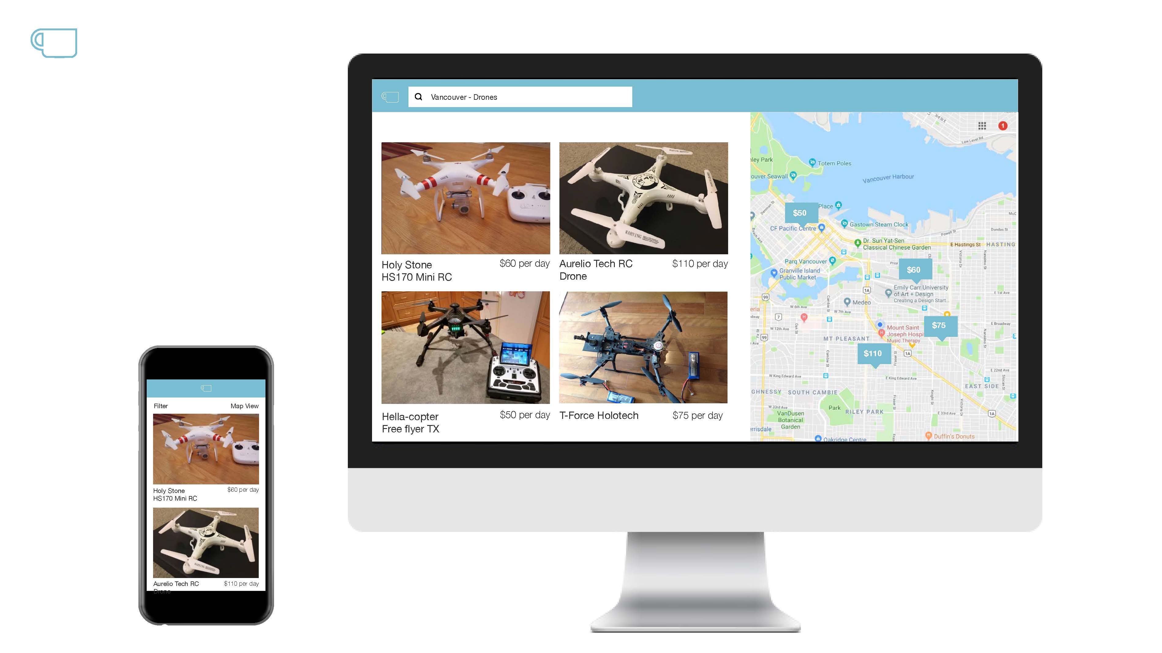
Cup of Sugar - Creating a Design Startup
Designer
Brit Williams
Cup of Sugar - Creating a Design Startup
Designer
Brit Williams
Over the course of a semester our challenge was to create a design startup pitch to present to guest judge entrepreneurs in Vancouver:
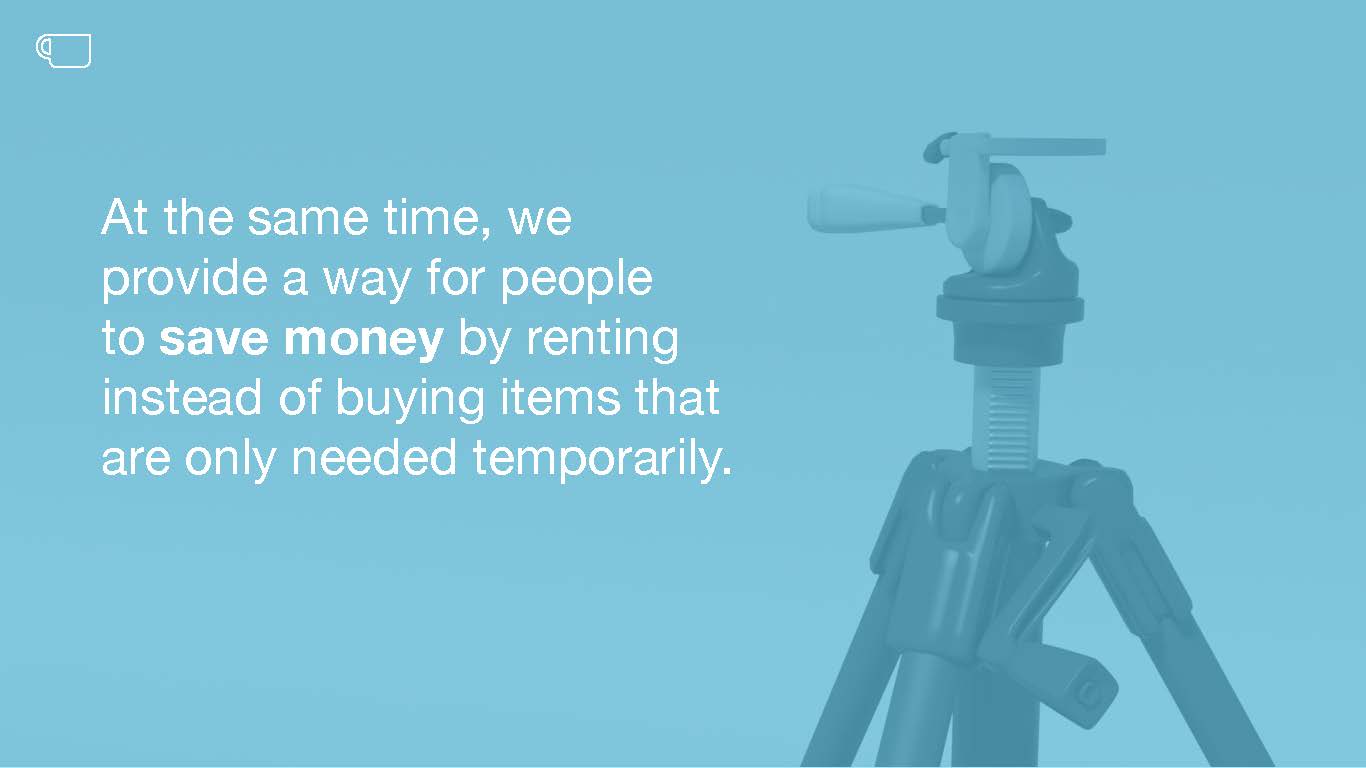
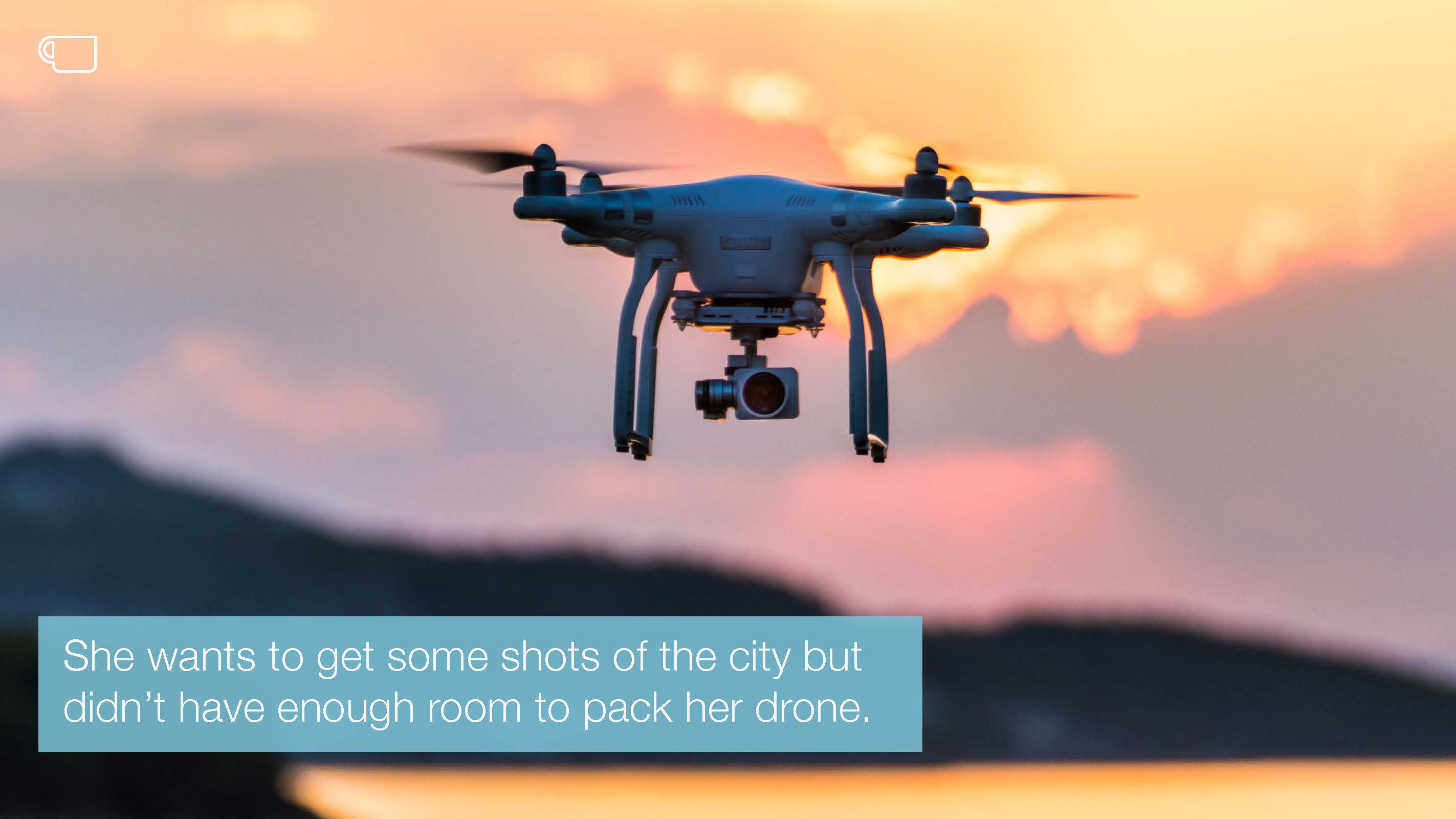
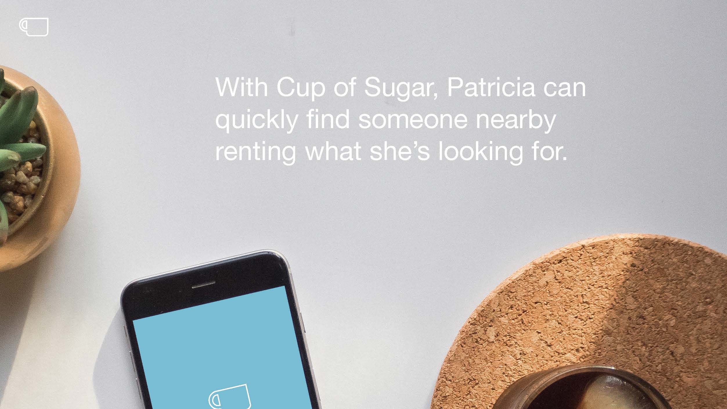
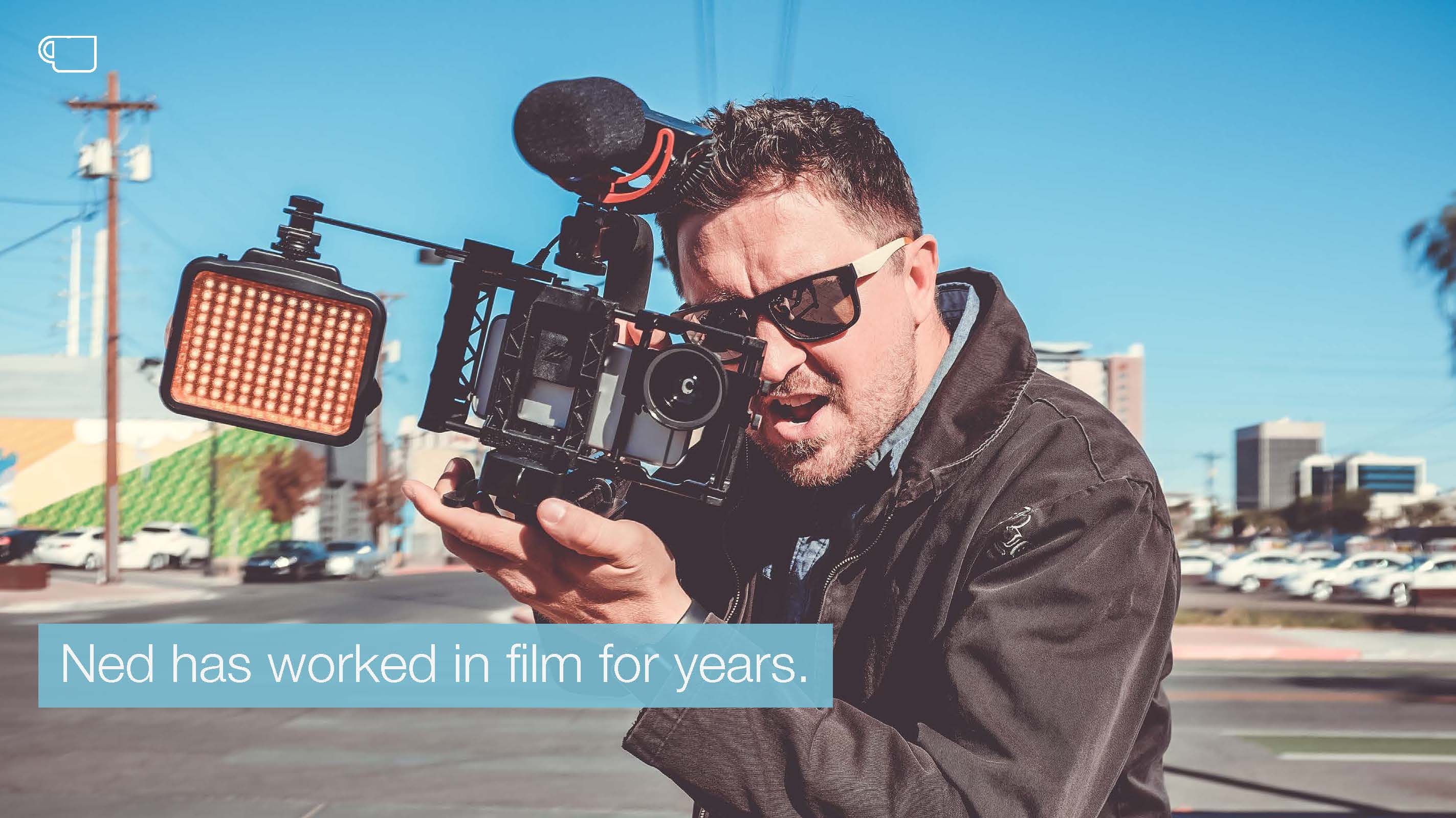
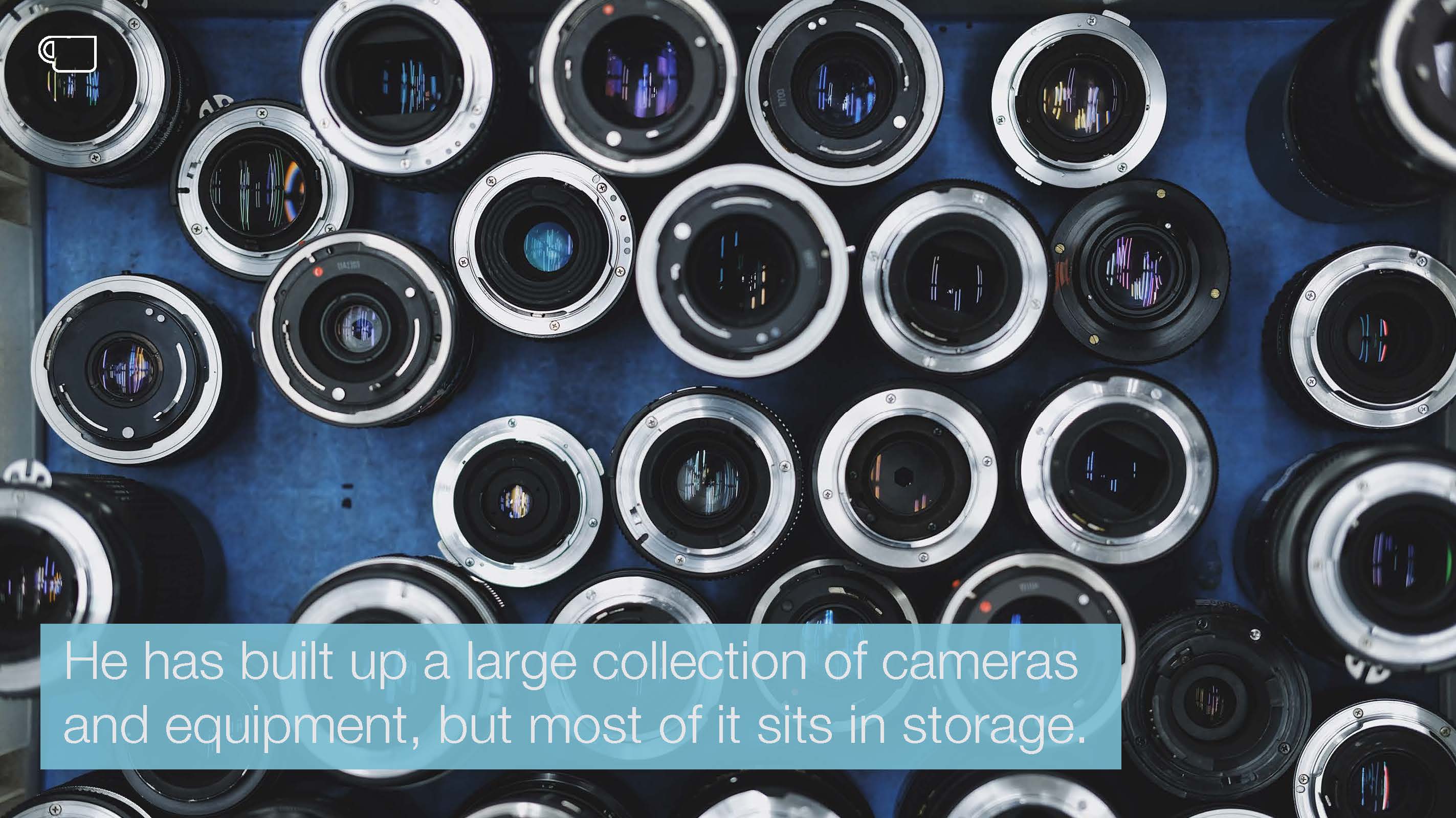
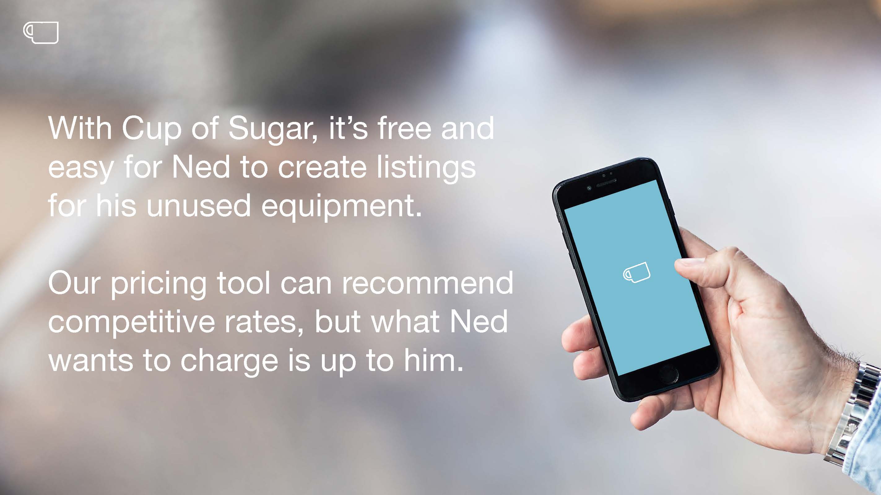
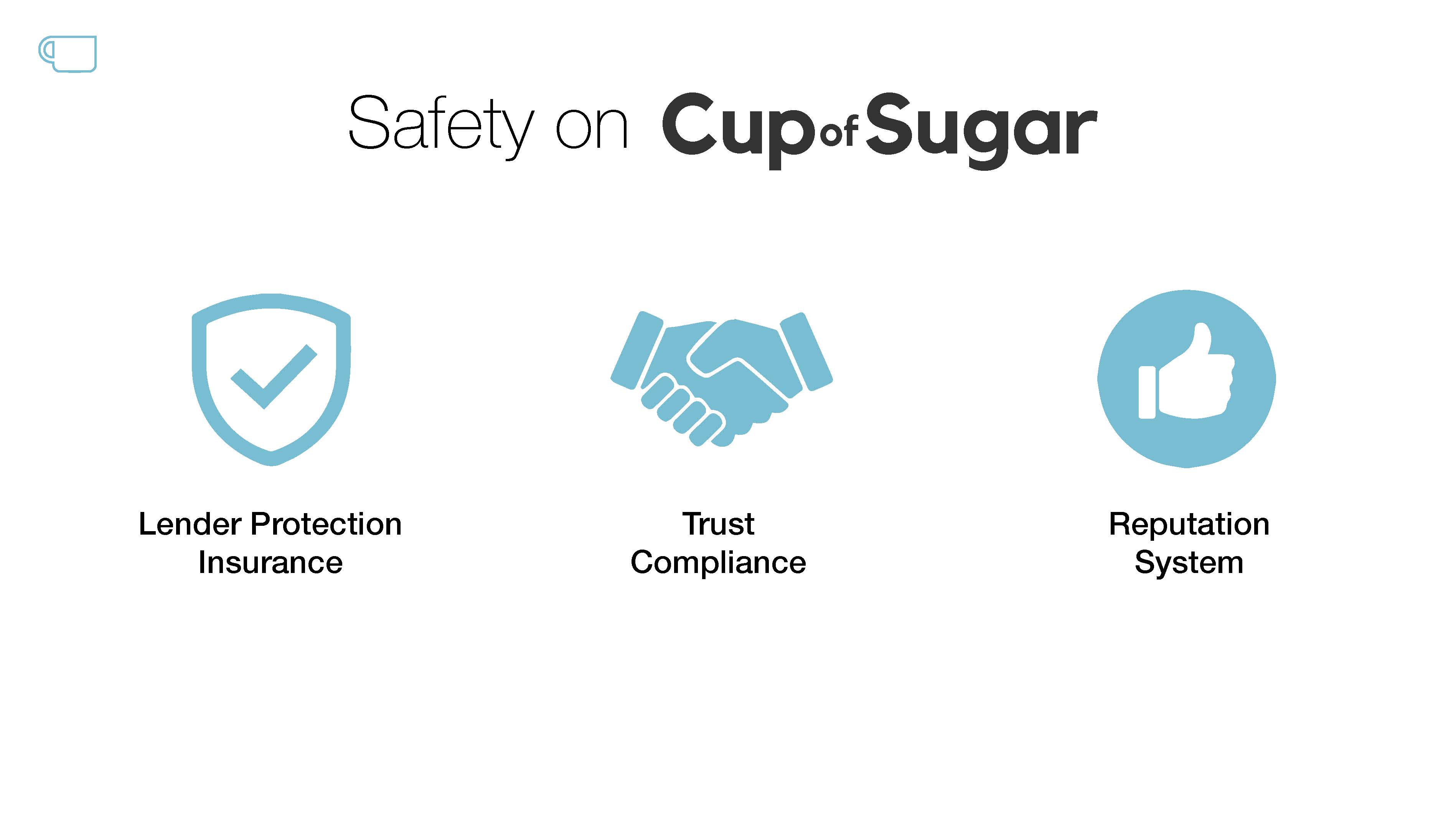
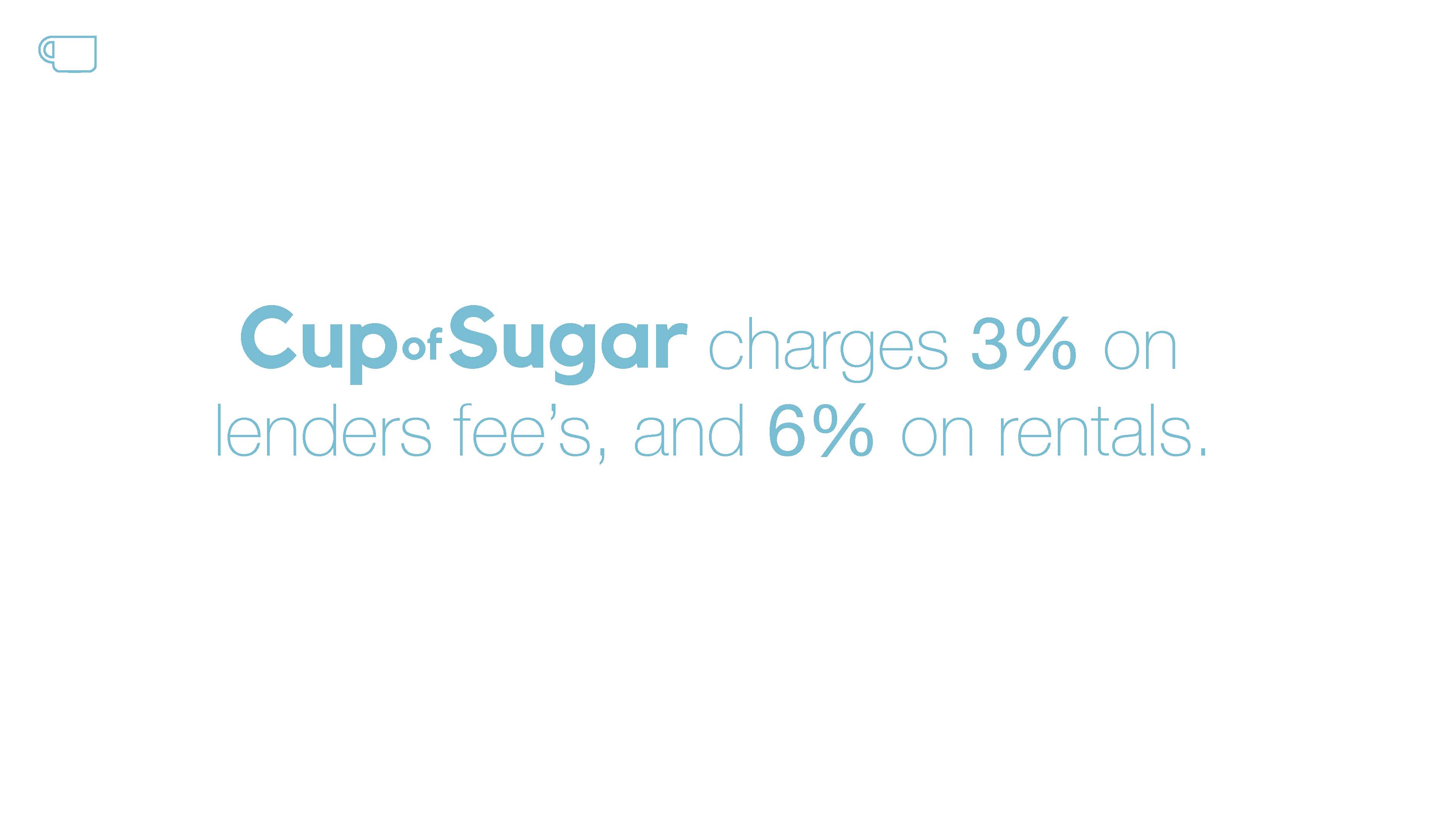
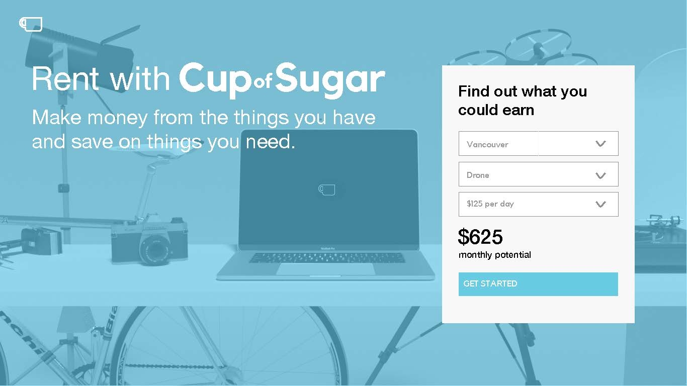
Cup of Sugar is a person to person rental platform that creates a shared economy by allowing users to lend the items they own for a profit, while also providing a way for people to save money borrowing items that are only needed temporarily.
Cup of Sugar is a person to person rental platform that creates a shared economy by allowing users to lend the items they own for a profit, while also providing a way for people to save money borrowing items that are only needed temporarily.